
Auric
Sherwin-Williams's Auric is a yellow shade whose quieter details emerge through comparison. Its beige classifications hint at the directions it may take as daylight, lamps and neighboring colors move around it. Because screens flatten both light and texture, sample the paint beside the finishes that will ultimately surround it.
Hex
#C48919LRV
29.73
Auric's Color Strip
Auric is the seventh shade on this 7-color strip, the deepest shade in this coordinated family. Color strip 136 groups these shades together so you can see how each reads next to its neighbors.


Auric in Rooms
Follow Auric from one space to another and watch how light, scale and surrounding materials reshape its character. 10 generated visualizations explore how the color might shape a finished room.
1 Dining Room Photo
The 1 dining room image turn a yellow swatch into something more spatial and expressive. Its brighter saturation allows the hue to remain present rather than fading quietly into the background.
Auric paint in a mid century dining room
@mybudgetrecipes
1 Bathroom Photo
Across 1 bathroom image, Auric (6692) meets window light, mirrors and focused task lighting. Its warm classification can feel inviting beside tactile, natural materials.

Auric — coastal bathroom
@mybudgetrecipes
1 Bedroom Photo
Auric (6692) moves through 1 bedroom image without becoming a fixed prescription for the room. Its warm classification can feel inviting beside tactile, natural materials.

A art deco bedroom painted in Auric
@mybudgetrecipes
1 Home Office Photo
Across 1 home office image, Auric (6692) meets daylight beside desk lamps and screen glow. Its warm classification can feel inviting beside tactile, natural materials.

Sherwin-Williams Auric in a warm home office
@mybudgetrecipes
1 Front Door Photo
The 1 front door image turn a yellow swatch into something more spatial and expressive. Its brighter saturation allows the hue to remain present rather than fading quietly into the background.

cottagecore front door featuring Auric by Sherwin-Williams
@mybudgetrecipes
1 Mudroom Photo
1 mudroom image place Auric (6692) in a practical threshold where the outdoors enters the home. An LRV of 29.7 lets the color hold its identity across both brighter and more shaded parts of the room.

Auric paint in a classy mudroom
@mybudgetrecipes
1 House Photo
Auric (6692) brings its yellow character into an exterior viewed across distance, weather and the changing sky. Its brighter saturation allows the hue to remain present rather than fading quietly into the background.

Auric color — eclectic house inspiration
@mybudgetrecipes
1 Patio Photo
These 1 patio image show how Auric (6692) can sit beside stone, timber, metal, textiles and greenery. The beige hue classifications suggest the subtle directions the color may take as the room changes.

minimalist patio featuring Auric by Sherwin-Williams
@mybudgetrecipes
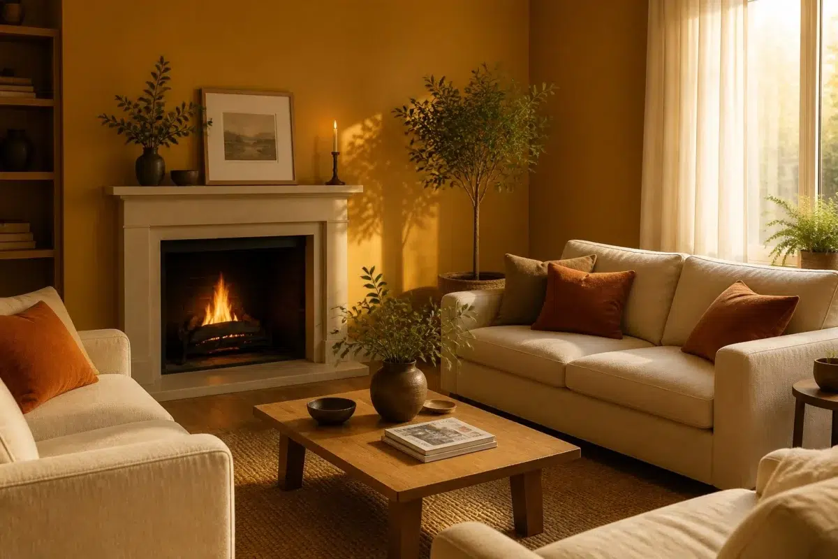
1 Living Room Photo
Across 1 living room image, Auric (6692) meets the movement from window light to lamplight. Its warm classification can feel inviting beside tactile, natural materials.

A cozy living room painted in Auric
@mybudgetrecipes
1 Kitchen Photo
Auric (6692) brings its yellow character into a hardworking room where color meets movement and strong surfaces. Its brighter saturation allows the hue to remain present rather than fading quietly into the background.

Auric — organic modern kitchen
@mybudgetrecipes
Expert Perspectives
Articles and features from across our network of home and design sites.
Coordinating Colors


At LRV 79 vs 30, Lemon Chiffon is decisively the brighter choice.


Shell White reflects far more light (LRV 83 vs 30), opening up a space where Auric encloses it.


A 8-point LRV gap (38 vs 30) makes Flexible Gray the marginally brighter of the two.
Trim Color
At LRV 79 vs 30, Lemon Chiffon is decisively the brighter choice.
Similar Colors


A 5-point LRV gap (35 vs 30) makes Crispy Gold the marginally brighter of the two.


Their light reflectance is nearly identical (LRV 30 vs 29), so neither reads brighter in a room.


Golden Rule reads slightly lighter (LRV 34 vs 30), a gap that shows most in low-lit rooms.


With LRVs of 32 and 30, the two reflect almost the same amount of light.


A 4-point LRV gap (30 vs 26) makes Auric the marginally brighter of the two.


Gold Crest reads slightly lighter (LRV 39 vs 30), a gap that shows most in low-lit rooms.


Glitzy Gold reads slightly lighter (LRV 39 vs 30), a gap that shows most in low-lit rooms.
Complementary Colors


Auric reflects far more light (LRV 30 vs 9), opening up a space where Endless Sea encloses it.


At LRV 30 vs 5, Auric is decisively the brighter choice.


At LRV 61 vs 30, Bewitching Blue is decisively the brighter choice.


Lighter Colors


At LRV 50 vs 30, Eye Catching is decisively the brighter choice.
Gold Crest reads slightly lighter (LRV 39 vs 30), a gap that shows most in low-lit rooms.


At LRV 48 vs 30, Gambol Gold is decisively the brighter choice.


Brittlebush reflects far more light (LRV 48 vs 30), opening up a space where Auric encloses it.
Color Codes
Manufacturer description
This radiant golden yellow glows with the warmth of sunlit honey and precious metals, conjuring images of late-afternoon light streaming through studio windows. Perfect for kitchens, creative spaces, or accent walls, it pairs beautifully with crisp whites and deep charcoals to amplify its luminous energy.