
Barely Pear
At first glance, Barely Pear belongs to the green family; in a room, light and context can make it far more elusive. With an LRV of 82.7, it sits on the light-reflective side of the palette and can feel especially open in generous daylight. 10 generated visualizations explore how the color might shape a finished room.
Hex
#EDEBDBLRV
82.73
Barely Pear in Rooms
Follow Barely Pear from one space to another and watch how light, scale and surrounding materials reshape its character. 10 generated visualizations explore how the color might shape a finished room.
1 Home Office Photo
Its place within Emerald Designer Edition - Classic + Collected hints at the range of palettes it can inhabit. In this setting, let daylight beside desk lamps and screen glow and wood, paper, shelving and upholstered seating guide the final sample decision.
Sherwin-Williams Barely Pear in a mid century home office
@mybudgetrecipes
1 Dining Room Photo
Against timber, table linen, glass and artwork, Barely Pear (9666) may feel quieter, sharper or more atmospheric than the digital swatch alone. Its LRV of 82.7 gives it a light-reflective character, though shadows and neighboring finishes can still draw out surprising depth.

Barely Pear paint in a mid century dining room
@mybudgetrecipes
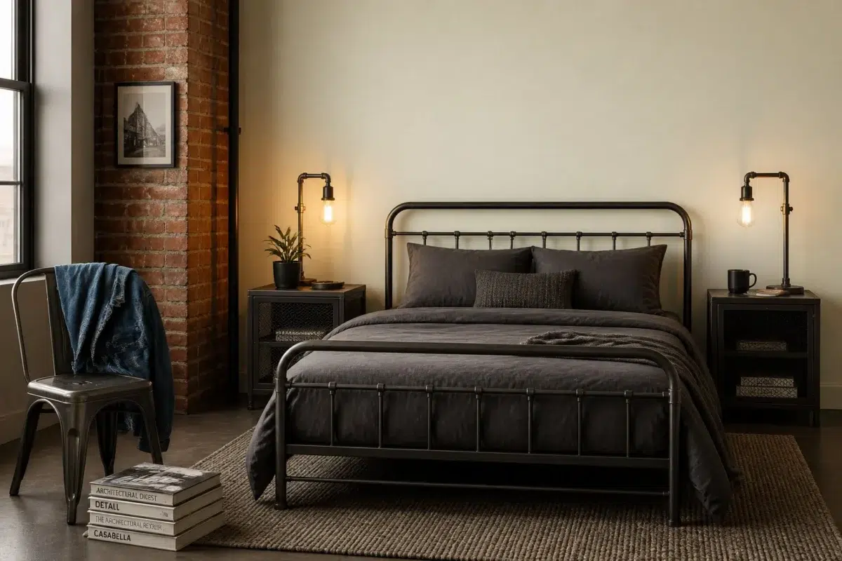
1 Bedroom Photo
Its place within Emerald Designer Edition - Classic + Collected hints at the range of palettes it can inhabit. In this setting, let gentle morning light and low evening lamps and bed linen, timber, wool and upholstered textures guide the final sample decision.

A industrial bedroom painted in Barely Pear
@mybudgetrecipes
1 Front Door Photo
1 front door image trace Barely Pear (9666) through the threshold between the street and the interior. Its place within Emerald Designer Edition - Classic + Collected hints at the range of palettes it can inhabit.

modern luxury front door featuring Barely Pear by Sherwin-Williams
@mybudgetrecipes
1 Bathroom Photo
The 1 bathroom image turn a green swatch into something more spatial and expressive. Its warm classification can feel inviting beside tactile, natural materials.

Barely Pear — earthy bathroom
@mybudgetrecipes
1 Kitchen Photo
Viewed across 1 kitchen image in a hardworking room where color meets movement and strong surfaces, Barely Pear (9666) reveals how much color depends on scale, surface and shadow. Its LRV of 82.7 gives it a light-reflective character, though shadows and neighboring finishes can still draw out surprising depth.

Barely Pear — vintage kitchen
@mybudgetrecipes
1 Mudroom Photo
Its place within Emerald Designer Edition - Classic + Collected hints at the range of palettes it can inhabit. In this setting, let doorway light and the softer illumination of an internal passage and flooring, storage, timber, baskets and hardware guide the final sample decision.

Barely Pear paint in a traditional mudroom
@mybudgetrecipes
1 Patio Photo
The 1 patio image turn a green swatch into something more spatial and expressive. Its warm classification can feel inviting beside tactile, natural materials.

boho patio featuring Barely Pear by Sherwin-Williams
@mybudgetrecipes
1 Living Room Photo
The room’s shift from daytime energy to evening calm can draw different notes from Barely Pear (9666). The beige, yellow hue classifications suggest the subtle directions the color may take as the room changes.

A cozy living room painted in Barely Pear
@mybudgetrecipes
1 House Photo
Its place within Emerald Designer Edition - Classic + Collected hints at the range of palettes it can inhabit. In this setting, let full daylight, cloud cover and long evening shadows and roofing, masonry, timber, planting and trim guide the final sample decision.

Barely Pear color — traditional house inspiration
@mybudgetrecipes
Expert Perspectives
Articles and features from across our network of home and design sites.
Coordinating Colors


At LRV 83 vs 54, Barely Pear is decisively the brighter choice.


Barely Pear reflects far more light (LRV 83 vs 19), opening up a space where Crooked River encloses it.

Barely Pear reflects far more light (LRV 83 vs 9), opening up a space where Stony Creek encloses it.
Similar Colors

With LRVs of 86 and 83, the two reflect almost the same amount of light.

With LRVs of 83 and 81, the two reflect almost the same amount of light.


Their light reflectance is nearly identical (LRV 83 vs 81), so neither reads brighter in a room.


With LRVs of 83 and 83, the two reflect almost the same amount of light.


Their light reflectance is nearly identical (LRV 83 vs 83), so neither reads brighter in a room.


Their light reflectance is nearly identical (LRV 83 vs 83), so neither reads brighter in a room.


A 8-point LRV gap (83 vs 75) makes Barely Pear the marginally brighter of the two.


Roman Column reads slightly lighter (LRV 88 vs 83), a gap that shows most in low-lit rooms.


Their light reflectance is nearly identical (LRV 83 vs 82), so neither reads brighter in a room.


Their light reflectance is nearly identical (LRV 83 vs 83), so neither reads brighter in a room.
Complementary Colors


Barely Pear reflects far more light (LRV 83 vs 7), opening up a space where Sea Mariner encloses it.


Barely Pear reflects far more light (LRV 83 vs 69), opening up a space where Starry Night encloses it.


At LRV 83 vs 20, Barely Pear is decisively the brighter choice.


At LRV 83 vs 28, Barely Pear is decisively the brighter choice.

Their light reflectance is nearly identical (LRV 83 vs 83), so neither reads brighter in a room.


Barely Pear reflects far more light (LRV 83 vs 6), opening up a space where Charcoal Blue encloses it.

Barely Pear reflects far more light (LRV 83 vs 4), opening up a space where Mountain Fig encloses it.
Lighter Colors


With LRVs of 84 and 83, the two reflect almost the same amount of light.
Their light reflectance is nearly identical (LRV 83 vs 82), so neither reads brighter in a room.


High Reflective White reads slightly lighter (LRV 93 vs 83), a gap that shows most in low-lit rooms.
Their light reflectance is nearly identical (LRV 83 vs 83), so neither reads brighter in a room.
Darker Colors


Barely Pear reads slightly lighter (LRV 83 vs 71), a gap that shows most in low-lit rooms.


At LRV 83 vs 57, Barely Pear is decisively the brighter choice.
With LRVs of 83 and 81, the two reflect almost the same amount of light.


At LRV 83 vs 51, Barely Pear is decisively the brighter choice.

A 6-point LRV gap (83 vs 76) makes Barely Pear the marginally brighter of the two.
Color Codes
Manufacturer description
This pale, luminous green whispers of new spring growth and orchard blossoms, with its soft yellow undertone creating an airy, optimistic atmosphere. Perfect for nurseries, powder rooms, or any space that deserves a gentle touch of nature's renewal.
Attributed to Sherwin-Williams catalog data.