
Basket Beige
Sherwin-Williams Basket Beige (6143) carries the measured structure of its color data and the less predictable beauty of paint in a finished space. It appears in Warm Neutrals, placing it within several distinct decorating stories rather than a single fixed look. The manufacturer's description below offers one reading; the room imagery leaves space for your own.
Hex
#C0A98BLRV
41.45
Basket Beige's Color Strip
Basket Beige is the third shade on this 7-color strip, sitting between Macadamia and Serengeti Grass. The strip spans from Softer Tan at the lightest end to Umber at the deepest. As part of strip 206, these colors are curated to work together — helpful when you're deciding how light or deep to go.


Basket Beige in Rooms
Follow Basket Beige from one space to another and watch how light, scale and surrounding materials reshape its character. 10 generated visualizations explore how the color might shape a finished room.
1 Front Door Photo
Basket Beige (6143) brings its yellow character into a small architectural moment with an outsized first impression. Its muted saturation softens the color’s edges, making texture and shadow part of the composition.
traditional front door featuring Basket Beige by Sherwin-Williams
@mybudgetrecipes
1 Dining Room Photo
Basket Beige (6143) offers a starting mood rather than a finished formula: Its warm classification can feel inviting beside tactile, natural materials. Test it under natural light, candles and pendant lighting.

Basket Beige paint in a art deco dining room
@mybudgetrecipes
1 Home Office Photo
1 home office image place Basket Beige (6143) in a focused room balancing work, concentration and comfort. An LRV of 41.5 lets the color hold its identity across both brighter and more shaded parts of the room.

Sherwin-Williams Basket Beige in a contemporary home office
@mybudgetrecipes
1 Bathroom Photo
1 bathroom image place Basket Beige (6143) in a compact setting where tile, fixtures and color sit close together. An LRV of 41.5 lets the color hold its identity across both brighter and more shaded parts of the room.

Basket Beige — traditional bathroom
@mybudgetrecipes
1 Bedroom Photo
Its place within Warm Neutrals hints at the range of palettes it can inhabit. In this setting, let gentle morning light and low evening lamps and bed linen, timber, wool and upholstered textures guide the final sample decision.

A boho bedroom painted in Basket Beige
@mybudgetrecipes
1 House Photo
Viewed across 1 house image in an exterior viewed across distance, weather and the changing sky, Basket Beige (6143) reveals how much color depends on scale, surface and shadow. An LRV of 41.5 lets the color hold its identity across both brighter and more shaded parts of the room.

Basket Beige color — aesthetic house inspiration
@mybudgetrecipes
1 Patio Photo
In an outdoor room surrounded by sky, planting and open light, the most interesting quality of Basket Beige (6143) may be the way it responds to stone, timber, metal, textiles and greenery. The beige hue classifications suggest the subtle directions the color may take as the room changes.

rustic modern patio featuring Basket Beige by Sherwin-Williams
@mybudgetrecipes
1 Living Room Photo
Basket Beige (6143) moves through 1 living room image without becoming a fixed prescription for the room. Its warm classification can feel inviting beside tactile, natural materials.

A mid century living room painted in Basket Beige
@mybudgetrecipes
1 Mudroom Photo
The daily movement of arrivals, departures and changing weather can draw different notes from Basket Beige (6143). The beige hue classifications suggest the subtle directions the color may take as the room changes.

Basket Beige paint in a neutral mudroom
@mybudgetrecipes
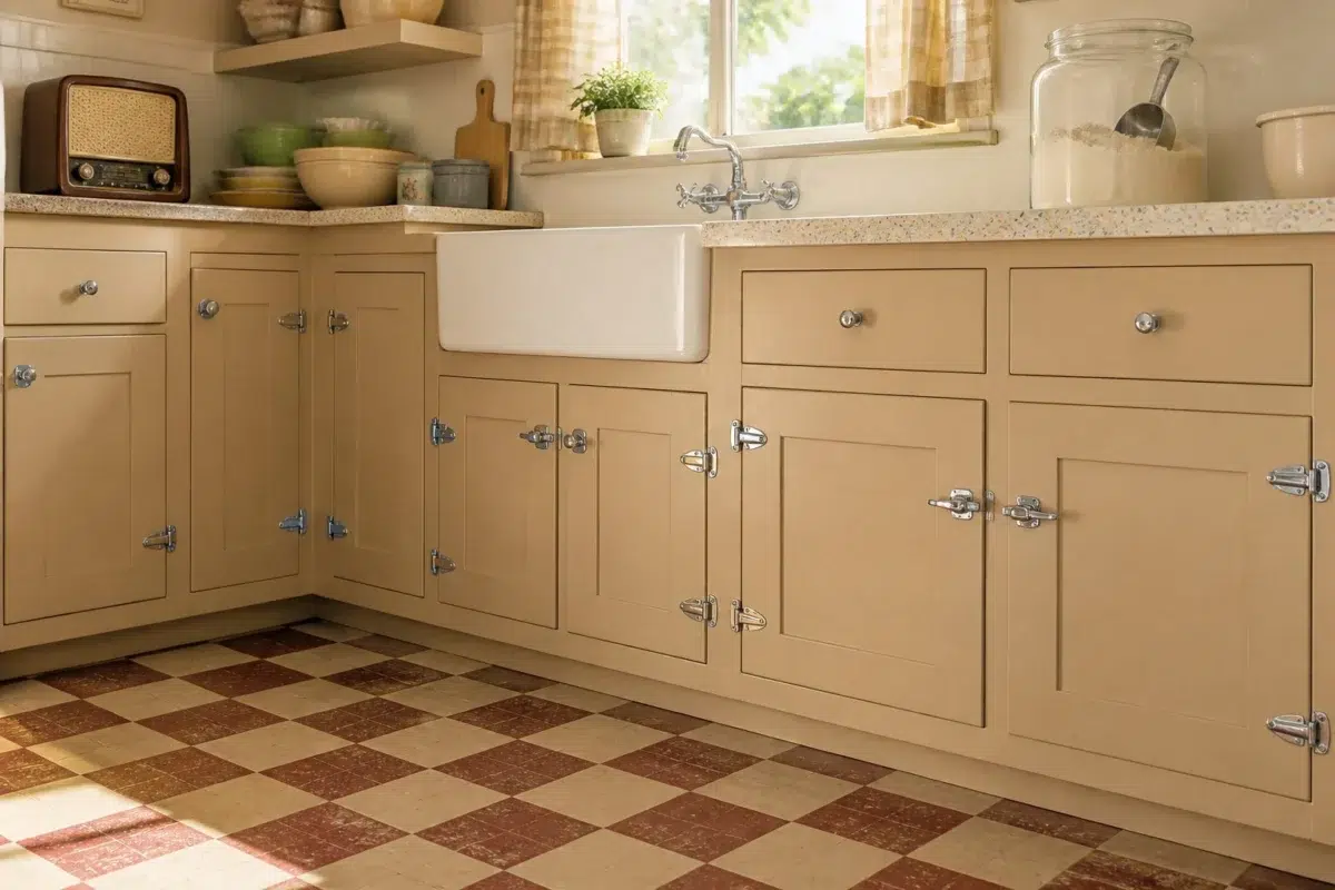
1 Kitchen Photo
Basket Beige (6143) brings its yellow character into a hardworking room where color meets movement and strong surfaces. Its muted saturation softens the color’s edges, making texture and shadow part of the composition.

Basket Beige — vintage kitchen
@mybudgetrecipes
Expert Perspectives
Articles and features from across our network of home and design sites.
Coordinating Colors


Moderate White reflects far more light (LRV 74 vs 41), opening up a space where Basket Beige encloses it.


At LRV 83 vs 41, Dover White is decisively the brighter choice.

Basket Beige reads slightly lighter (LRV 41 vs 38), a gap that shows most in low-lit rooms.
Trim Color
Moderate White reflects far more light (LRV 74 vs 41), opening up a space where Basket Beige encloses it.
Similar Colors


Their light reflectance is nearly identical (LRV 42 vs 41), so neither reads brighter in a room.

With LRVs of 42 and 41, the two reflect almost the same amount of light.


Their light reflectance is nearly identical (LRV 44 vs 41), so neither reads brighter in a room.

Their light reflectance is nearly identical (LRV 41 vs 40), so neither reads brighter in a room.


With LRVs of 42 and 41, the two reflect almost the same amount of light.

Their light reflectance is nearly identical (LRV 41 vs 39), so neither reads brighter in a room.


Their light reflectance is nearly identical (LRV 41 vs 40), so neither reads brighter in a room.


A 4-point LRV gap (41 vs 38) makes Basket Beige the marginally brighter of the two.


With LRVs of 43 and 41, the two reflect almost the same amount of light.

A 3-point LRV gap (45 vs 41) makes Sawgrass Basket the marginally brighter of the two.
Complementary Colors


At LRV 41 vs 6, Basket Beige is decisively the brighter choice.


A 8-point LRV gap (41 vs 34) makes Basket Beige the marginally brighter of the two.


At LRV 41 vs 7, Basket Beige is decisively the brighter choice.


At LRV 41 vs 11, Basket Beige is decisively the brighter choice.


At LRV 41 vs 7, Basket Beige is decisively the brighter choice.


At LRV 69 vs 41, Starry Night is decisively the brighter choice.


Basket Beige reflects far more light (LRV 41 vs 20), opening up a space where Soulful Blue encloses it.
Lighter Colors


A 9-point LRV gap (50 vs 41) makes Bona Fide Beige the marginally brighter of the two.


At LRV 58 vs 41, Touch of Sand is decisively the brighter choice.


A 4-point LRV gap (45 vs 41) makes Renwick Beige the marginally brighter of the two.


A 9-point LRV gap (50 vs 41) makes Dhurrie Beige the marginally brighter of the two.

Woolen Mittens reads slightly lighter (LRV 46 vs 41), a gap that shows most in low-lit rooms.
Darker Colors

Basket Beige reflects far more light (LRV 41 vs 25), opening up a space where Rookwood Antique Gold encloses it.


Basket Beige reads slightly lighter (LRV 41 vs 36), a gap that shows most in low-lit rooms.


At LRV 41 vs 22, Basket Beige is decisively the brighter choice.


Basket Beige reads slightly lighter (LRV 41 vs 31), a gap that shows most in low-lit rooms.


A 8-point LRV gap (41 vs 33) makes Basket Beige the marginally brighter of the two.
Color Codes
Manufacturer description
This rush-colored tan provides a soft energy in rooms where you gather. Pairs well with warm, off-whites like Dover White or Modern White.