
Baguette
Sherwin-Williams Baguette (6123) carries the measured structure of its color data and the less predictable beauty of paint in a finished space. Its midtone saturation balances color with restraint, so the hue can register without overwhelming nearby finishes. Move between the room imagery, color measurements and coordinating shades to build a fuller sense of how it might live in your space.
Hex
#B39167LRV
30.82
Baguette's Color Strip
Baguette is the fifth shade on this 7-color strip, sitting between Coriander Powder and Cardboard. The strip spans from Believable Buff at the lightest end to Craft Paper at the deepest. Strip 141 makes it easy to compare shades side by side and find the right depth for your space.


Baguette in Rooms
Follow Baguette from one space to another and watch how light, scale and surrounding materials reshape its character. 10 generated visualizations explore how the color might shape a finished room.
1 Home Office Photo
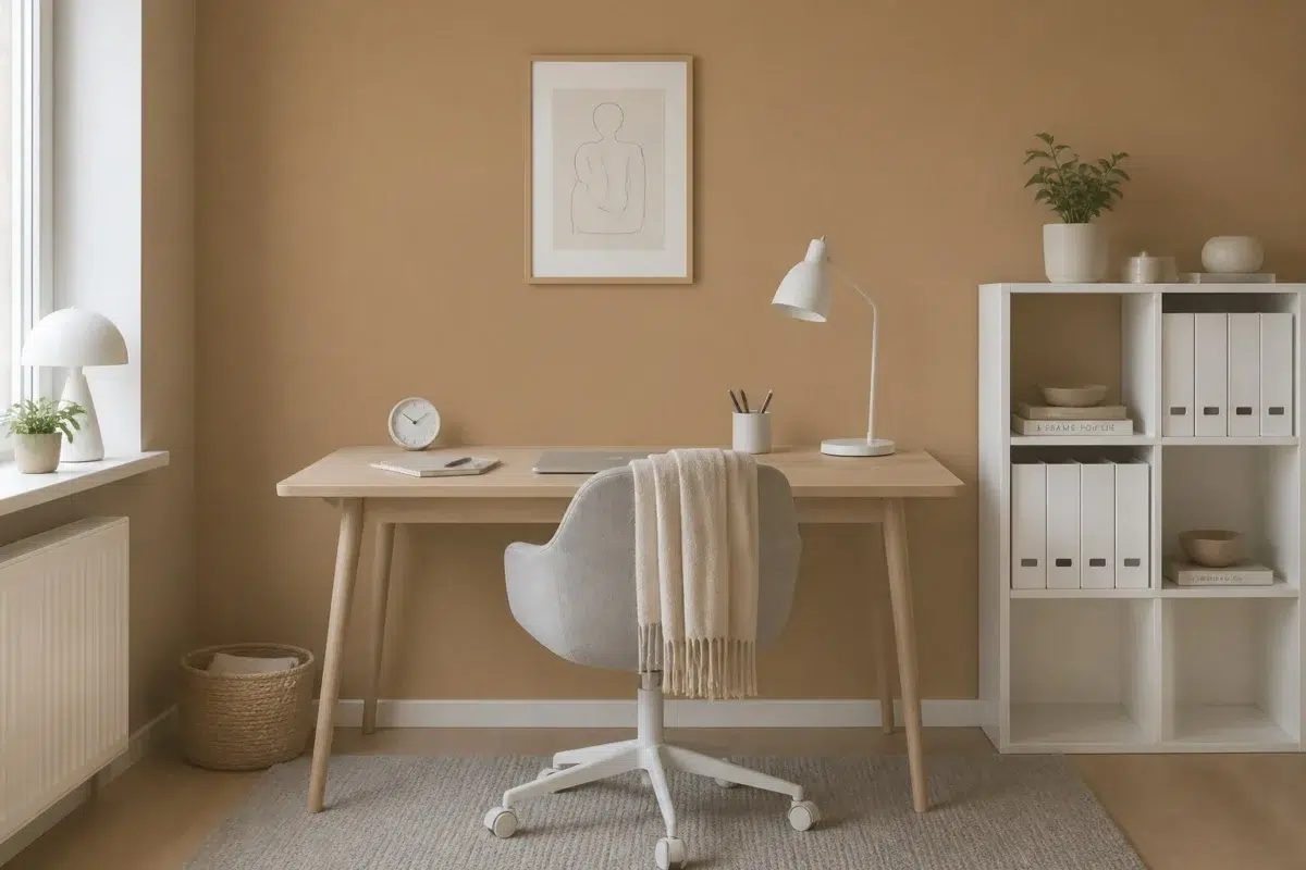
1 home office image place Baguette (6123) in a focused room balancing work, concentration and comfort. An LRV of 30.8 lets the color hold its identity across both brighter and more shaded parts of the room.
Sherwin-Williams Baguette in a scandinavian home office
@mybudgetrecipes
1 Bathroom Photo
The contrast between bright mornings and quieter evening light can draw different notes from Baguette (6123). The beige hue classifications suggest the subtle directions the color may take as the room changes.

Baguette — vintage bathroom
@mybudgetrecipes
1 Dining Room Photo
The 1 dining room image turn a yellow swatch into something more spatial and expressive. Its midtone saturation keeps the color expressive without letting it dominate every surface around it.

Baguette paint in a art deco dining room
@mybudgetrecipes
1 Bedroom Photo
The 1 bedroom image turn a yellow swatch into something more spatial and expressive. Its midtone saturation keeps the color expressive without letting it dominate every surface around it.

A minimalist bedroom painted in Baguette
@mybudgetrecipes
1 Front Door Photo
Baguette (6123) moves through 1 front door image without becoming a fixed prescription for the room. Its warm classification can feel inviting beside tactile, natural materials.

minimalist front door featuring Baguette by Sherwin-Williams
@mybudgetrecipes
1 House Photo
The 1 house image turn a yellow swatch into something more spatial and expressive. Its midtone saturation keeps the color expressive without letting it dominate every surface around it.

Baguette color — mediterranean house inspiration
@mybudgetrecipes
1 Mudroom Photo
Baguette (6123) can change noticeably under doorway light and the softer illumination of an internal passage. Sample it beside the finishes that will remain in the room.

Baguette paint in a neutral mudroom
@mybudgetrecipes
1 Kitchen Photo
Baguette (6123) brings its yellow character into a hardworking room where color meets movement and strong surfaces. Its midtone saturation keeps the color expressive without letting it dominate every surface around it.

Baguette — vintage kitchen
@mybudgetrecipes
1 Patio Photo
1 patio image place Baguette (6123) in an outdoor room surrounded by sky, planting and open light. An LRV of 30.8 lets the color hold its identity across both brighter and more shaded parts of the room.

mediterranean patio featuring Baguette by Sherwin-Williams
@mybudgetrecipes
1 Living Room Photo
These 1 living room image show how Baguette (6123) can sit beside upholstery, timber, art and metal accents. The beige hue classifications suggest the subtle directions the color may take as the room changes.

A contemporary living room painted in Baguette
@mybudgetrecipes
Expert Perspectives
Articles and features from across our network of home and design sites.
Coordinating Colors


Antique White reflects far more light (LRV 72 vs 31), opening up a space where Baguette encloses it.


At LRV 66 vs 31, Irish Cream is decisively the brighter choice.


Trim Color
Antique White reflects far more light (LRV 72 vs 31), opening up a space where Baguette encloses it.
Similar Colors

Woven Wicker reads slightly lighter (LRV 34 vs 31), a gap that shows most in low-lit rooms.


With LRVs of 31 and 30, the two reflect almost the same amount of light.


Coriander Powder reads slightly lighter (LRV 36 vs 31), a gap that shows most in low-lit rooms.


Mannered Gold reads slightly lighter (LRV 34 vs 31), a gap that shows most in low-lit rooms.


A 4-point LRV gap (35 vs 31) makes Rustic City the marginally brighter of the two.


Caramelized reads slightly lighter (LRV 35 vs 31), a gap that shows most in low-lit rooms.
Complementary Colors


At LRV 31 vs 6, Baguette is decisively the brighter choice.


At LRV 31 vs 11, Baguette is decisively the brighter choice.


At LRV 31 vs 7, Baguette is decisively the brighter choice.


At LRV 69 vs 31, Starry Night is decisively the brighter choice.


Baguette reads slightly lighter (LRV 31 vs 20), a gap that shows most in low-lit rooms.
Lighter Colors

Sands Of Time reads slightly lighter (LRV 39 vs 31), a gap that shows most in low-lit rooms.


Urban Putty reflects far more light (LRV 54 vs 31), opening up a space where Baguette encloses it.


Downing Sand reflects far more light (LRV 51 vs 31), opening up a space where Baguette encloses it.

Threaded Loom reflects far more light (LRV 54 vs 31), opening up a space where Baguette encloses it.

A 8-point LRV gap (39 vs 31) makes Sensational Sand the marginally brighter of the two.
Darker Colors

Baguette reads slightly lighter (LRV 31 vs 19), a gap that shows most in low-lit rooms.

Baguette reflects far more light (LRV 31 vs 13), opening up a space where Timber Beam encloses it.

Baguette reads slightly lighter (LRV 31 vs 25), a gap that shows most in low-lit rooms.


Baguette reflects far more light (LRV 31 vs 15), opening up a space where Craft Paper encloses it.
Color Codes
Manufacturer description
This warm, golden yellow captures the crusty perfection of fresh-baked bread pulled from the oven, radiating comfort and nourishment. Perfect for kitchens and dining spaces, its mellow saturation pairs beautifully with cream whites and warm wood tones to create an inviting, lived-in atmosphere.