
Camelback
Camelback begins as a yellow color on paper, then shifts with every surface, shadow and neighboring material. It appears in Warm Neutrals, placing it within several distinct decorating stories rather than a single fixed look. The manufacturer's description below offers one reading; the room imagery leaves space for your own.
Hex
#C5AA85LRV
42.31
Camelback's Color Strip
Camelback is the third shade on this 7-color strip, sitting between Whole Wheat and Coriander Powder. The strip spans from Believable Buff at the lightest end to Craft Paper at the deepest. Strip 141 makes it easy to compare shades side by side and find the right depth for your space.


Camelback in Rooms
Follow Camelback from one space to another and watch how light, scale and surrounding materials reshape its character. 10 generated visualizations explore how the color might shape a finished room.
1 Home Office Photo
The transition between focused work and the rest of the home can draw different notes from Camelback (6122). The beige hue classifications suggest the subtle directions the color may take as the room changes.
Sherwin-Williams Camelback in a industrial home office
@mybudgetrecipes
1 Dining Room Photo
1 generated visualization explores how the color might shape the finished space. Together they show Camelback (6122) as inspiration rather than a promise of an identical result.

Camelback paint in a boho dining room
@mybudgetrecipes
1 Front Door Photo
The threshold between the street and the interior can draw different notes from Camelback (6122). The beige hue classifications suggest the subtle directions the color may take as the room changes.

bold front door featuring Camelback by Sherwin-Williams
@mybudgetrecipes
1 Bathroom Photo
Camelback (6122) moves through 1 bathroom image without becoming a fixed prescription for the room. Its warm classification can feel inviting beside tactile, natural materials.

Camelback — earthy bathroom
@mybudgetrecipes
1 Bedroom Photo
The slower pace of morning and night can draw different notes from Camelback (6122). The beige hue classifications suggest the subtle directions the color may take as the room changes.

A organic modern bedroom painted in Camelback
@mybudgetrecipes
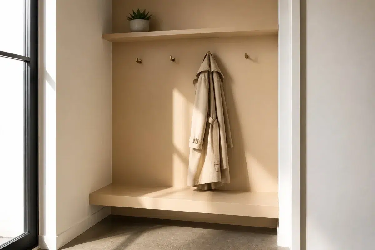
1 Mudroom Photo
In a practical threshold where the outdoors enters the home, the most interesting quality of Camelback (6122) may be the way it responds to flooring, storage, timber, baskets and hardware. The beige hue classifications suggest the subtle directions the color may take as the room changes.

Camelback paint in a tiny mudroom
@mybudgetrecipes
1 Patio Photo
Against stone, timber, metal, textiles and greenery, Camelback (6122) may feel quieter, sharper or more atmospheric than the digital swatch alone. An LRV of 42.3 lets the color hold its identity across both brighter and more shaded parts of the room.

warm patio featuring Camelback by Sherwin-Williams
@mybudgetrecipes
1 Living Room Photo
Across 1 living room image, Camelback (6122) meets the movement from window light to lamplight. Its warm classification can feel inviting beside tactile, natural materials.

A elegant living room painted in Camelback
@mybudgetrecipes
1 House Photo
Camelback (6122) moves through 1 house image without becoming a fixed prescription for the room. Its warm classification can feel inviting beside tactile, natural materials.

Camelback color — traditional house inspiration
@mybudgetrecipes
1 Kitchen Photo
Camelback (6122) brings its yellow character into a hardworking room where color meets movement and strong surfaces. Its midtone saturation keeps the color expressive without letting it dominate every surface around it.

Camelback — contemporary kitchen
@mybudgetrecipes
Expert Perspectives
Articles and features from across our network of home and design sites.
Coordinating Colors


Antique White reflects far more light (LRV 72 vs 42), opening up a space where Camelback encloses it.


Chopsticks reflects far more light (LRV 65 vs 42), opening up a space where Camelback encloses it.


Camelback reflects far more light (LRV 42 vs 20), opening up a space where Warm Stone encloses it.
Trim Color
Antique White reflects far more light (LRV 72 vs 42), opening up a space where Camelback encloses it.
Similar Colors


Their light reflectance is nearly identical (LRV 44 vs 42), so neither reads brighter in a room.


Their light reflectance is nearly identical (LRV 42 vs 42), so neither reads brighter in a room.


With LRVs of 42 and 42, the two reflect almost the same amount of light.


With LRVs of 42 and 41, the two reflect almost the same amount of light.

With LRVs of 43 and 42, the two reflect almost the same amount of light.


Their light reflectance is nearly identical (LRV 43 vs 42), so neither reads brighter in a room.


With LRVs of 45 and 42, the two reflect almost the same amount of light.


Complementary Colors


At LRV 42 vs 11, Camelback is decisively the brighter choice.


At LRV 42 vs 7, Camelback is decisively the brighter choice.


At LRV 69 vs 42, Starry Night is decisively the brighter choice.


Camelback reflects far more light (LRV 42 vs 20), opening up a space where Soulful Blue encloses it.


At LRV 42 vs 22, Camelback is decisively the brighter choice.


Camelback reflects far more light (LRV 42 vs 28), opening up a space where Dusty Heather encloses it.
Lighter Colors


Nomadic Desert reads slightly lighter (LRV 46 vs 42), a gap that shows most in low-lit rooms.
With LRVs of 42 and 41, the two reflect almost the same amount of light.

Their light reflectance is nearly identical (LRV 45 vs 42), so neither reads brighter in a room.

Darker Colors


A 8-point LRV gap (42 vs 35) makes Camelback the marginally brighter of the two.


Camelback reads slightly lighter (LRV 42 vs 37), a gap that shows most in low-lit rooms.


Camelback reads slightly lighter (LRV 42 vs 36), a gap that shows most in low-lit rooms.

Color Codes
Manufacturer description
Cultivate a cozy feeling in your home with this toasty beige that radiates warmth without being overpowering.