
Blue Bauble
At first glance, Blue Bauble belongs to the blue family; in a room, light and context can make it far more elusive. An LRV of 66.4 places it through the middle of the scale, where color and depth can remain visible as the light changes. Because screens flatten both light and texture, sample the paint beside the finishes that will ultimately surround it.
Hex
#ABDEE3LRV
66.39
Blue Bauble in Rooms
Follow Blue Bauble from one space to another and watch how light, scale and surrounding materials reshape its character. 10 generated visualizations explore how the color might shape a finished room.
1 Front Door Photo
1 front door image place Blue Bauble (6948) in a small architectural moment with an outsized first impression. An LRV of 66.4 lets the color hold its identity across both brighter and more shaded parts of the room.
mediterranean front door featuring Blue Bauble by Sherwin-Williams
@mybudgetrecipes
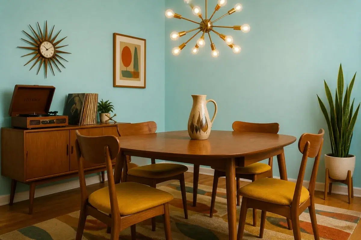
1 Dining Room Photo
These 1 dining room image show how Blue Bauble (6948) can sit beside timber, table linen, glass and artwork. The blue hue classifications suggest the subtle directions the color may take as the room changes.

Blue Bauble paint in a mid century dining room
@mybudgetrecipes
1 Home Office Photo
Blue Bauble (6948) moves through 1 home office image without becoming a fixed prescription for the room. Its cool classification can bring a composed, clean tension to warmer finishes.

Sherwin-Williams Blue Bauble in a warm home office
@mybudgetrecipes
1 Bedroom Photo
1 bedroom image place Blue Bauble (6948) in a room designed around rest, softness and retreat. An LRV of 66.4 lets the color hold its identity across both brighter and more shaded parts of the room.

A scandinavian bedroom painted in Blue Bauble
@mybudgetrecipes
1 Bathroom Photo
These 1 bathroom image show how Blue Bauble (6948) can sit beside tile, stone, glass, timber and metal fixtures. The blue hue classifications suggest the subtle directions the color may take as the room changes.

Blue Bauble — minimalist bathroom
@mybudgetrecipes
1 Living Room Photo
The blue hue classifications suggest the subtle directions the color may take as the room changes. In this setting, let the movement from window light to lamplight and upholstery, timber, art and metal accents guide the final sample decision.

A elegant living room painted in Blue Bauble
@mybudgetrecipes
1 Kitchen Photo
Blue Bauble (6948) offers a starting mood rather than a finished formula: Its cool classification can bring a composed, clean tension to warmer finishes. Test it under daylight, task lighting and evening pendants.

Blue Bauble — vintage kitchen
@mybudgetrecipes
1 Mudroom Photo
Against flooring, storage, timber, baskets and hardware, Blue Bauble (6948) may feel quieter, sharper or more atmospheric than the digital swatch alone. An LRV of 66.4 lets the color hold its identity across both brighter and more shaded parts of the room.

Blue Bauble paint in a traditional mudroom
@mybudgetrecipes
1 House Photo
The blue hue classifications suggest the subtle directions the color may take as the room changes. In this setting, let full daylight, cloud cover and long evening shadows and roofing, masonry, timber, planting and trim guide the final sample decision.

Blue Bauble color — traditional house inspiration
@mybudgetrecipes
1 Patio Photo
Viewed across 1 patio image in an outdoor room surrounded by sky, planting and open light, Blue Bauble (6948) reveals how much color depends on scale, surface and shadow. An LRV of 66.4 lets the color hold its identity across both brighter and more shaded parts of the room.

industrial patio featuring Blue Bauble by Sherwin-Williams
@mybudgetrecipes
Expert Perspectives
Articles and features from across our network of home and design sites.
Coordinating Colors


At LRV 66 vs 4, Blue Bauble is decisively the brighter choice.


At LRV 82 vs 66, Alabaster is decisively the brighter choice.
Similar Colors


Their light reflectance is nearly identical (LRV 69 vs 66), so neither reads brighter in a room.


With LRVs of 66 and 64, the two reflect almost the same amount of light.

A 4-point LRV gap (70 vs 66) makes Pool Blue the marginally brighter of the two.

A 6-point LRV gap (66 vs 60) makes Blue Bauble the marginally brighter of the two.

With LRVs of 68 and 66, the two reflect almost the same amount of light.


A 8-point LRV gap (66 vs 58) makes Blue Bauble the marginally brighter of the two.

A 7-point LRV gap (73 vs 66) makes Swimming the marginally brighter of the two.


A 6-point LRV gap (66 vs 60) makes Blue Bauble the marginally brighter of the two.


Blue Bauble reflects far more light (LRV 66 vs 54), opening up a space where Gentle Aquamarine encloses it.


A 3-point LRV gap (66 vs 63) makes Blue Bauble the marginally brighter of the two.
Complementary Colors

Mauve Tinge reads slightly lighter (LRV 76 vs 66), a gap that shows most in low-lit rooms.


At LRV 66 vs 50, Blue Bauble is decisively the brighter choice.


Blue Bauble reflects far more light (LRV 66 vs 35), opening up a space where Truly Taupe encloses it.


At LRV 66 vs 5, Blue Bauble is decisively the brighter choice.


Blue Bauble reads slightly lighter (LRV 66 vs 57), a gap that shows most in low-lit rooms.

Blue Bauble reflects far more light (LRV 66 vs 4), opening up a space where Rockweed encloses it.


Blue Bauble reflects far more light (LRV 66 vs 27), opening up a space where Rosaline Pearl encloses it.
Lighter Colors
A 4-point LRV gap (70 vs 66) makes Pool Blue the marginally brighter of the two.
Their light reflectance is nearly identical (LRV 69 vs 66), so neither reads brighter in a room.
With LRVs of 68 and 66, the two reflect almost the same amount of light.
Darker Colors


A 11-point LRV gap (66 vs 56) makes Blue Bauble the marginally brighter of the two.


At LRV 66 vs 46, Blue Bauble is decisively the brighter choice.


Blue Bauble reflects far more light (LRV 66 vs 39), opening up a space where Fountain encloses it.


Blue Bauble reads slightly lighter (LRV 66 vs 56), a gap that shows most in low-lit rooms.
A 6-point LRV gap (66 vs 60) makes Blue Bauble the marginally brighter of the two.
Color Codes
Manufacturer description
This crystalline light blue evokes the delicate shimmer of ornamental glass catching winter sunlight, with cool undertones that feel both airy and refined. Perfect for bathrooms or bedrooms seeking a serene, jewel-like atmosphere that feels both playful and restful.