
Blue Refrain
There is more to Sherwin-Williams Blue Refrain (6956) than the swatch alone: its depth, undertones and setting all shape the final impression. Its blue classifications hint at the directions it may take as daylight, lamps and neighboring colors move around it. Its related shades below reveal where the color harmonizes—and where contrast brings it fully to life.
Hex
#B0D8E7LRV
64.25
Blue Refrain in Rooms
Follow Blue Refrain from one space to another and watch how light, scale and surrounding materials reshape its character. 10 generated visualizations explore how the color might shape a finished room.
1 Front Door Photo
Across 1 front door image, Blue Refrain (6956) meets direct sun, porch shade and evening exterior light. Its cool classification can bring a composed, clean tension to warmer finishes.
bold front door featuring Blue Refrain by Sherwin-Williams
@mybudgetrecipes
1 Bedroom Photo
Blue Refrain (6956) brings its blue character into a room designed around rest, softness and retreat. Its cool classification can bring a composed, clean tension to warmer finishes.

A boho bedroom painted in Blue Refrain
@mybudgetrecipes
1 Home Office Photo
Blue Refrain (6956) offers a starting mood rather than a finished formula: Its cool classification can bring a composed, clean tension to warmer finishes. Test it under daylight beside desk lamps and screen glow.

Sherwin-Williams Blue Refrain in a warm home office
@mybudgetrecipes
1 Dining Room Photo
In a gathering space that can move from daylight to ceremony, the most interesting quality of Blue Refrain (6956) may be the way it responds to timber, table linen, glass and artwork. The blue hue classifications suggest the subtle directions the color may take as the room changes.

Blue Refrain paint in a elegant dining room
@mybudgetrecipes
1 Bathroom Photo
The contrast between bright mornings and quieter evening light can draw different notes from Blue Refrain (6956). The blue hue classifications suggest the subtle directions the color may take as the room changes.

Blue Refrain — earthy bathroom
@mybudgetrecipes
1 Kitchen Photo
Blue Refrain (6956) moves through 1 kitchen image without becoming a fixed prescription for the room. Its cool classification can bring a composed, clean tension to warmer finishes.

Blue Refrain — vintage kitchen
@mybudgetrecipes
1 Mudroom Photo
The 1 mudroom image turn a blue swatch into something more spatial and expressive. Its cool classification can bring a composed, clean tension to warmer finishes.

Blue Refrain paint in a earthy mudroom
@mybudgetrecipes
1 House Photo
Blue Refrain (6956) offers a starting mood rather than a finished formula: Its cool classification can bring a composed, clean tension to warmer finishes. Test it under full daylight, cloud cover and long evening shadows.

Blue Refrain color — rustic modern house inspiration
@mybudgetrecipes
1 Patio Photo
The blue hue classifications suggest the subtle directions the color may take as the room changes. In this setting, let direct sun, reflected daylight and deep exterior shade and stone, timber, metal, textiles and greenery guide the final sample decision.

contemporary patio featuring Blue Refrain by Sherwin-Williams
@mybudgetrecipes
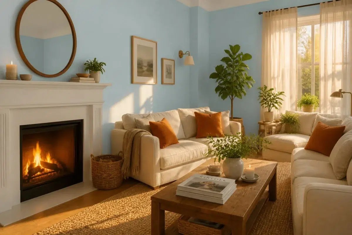
1 Living Room Photo
Against upholstery, timber, art and metal accents, Blue Refrain (6956) may feel quieter, sharper or more atmospheric than the digital swatch alone. An LRV of 64.3 lets the color hold its identity across both brighter and more shaded parts of the room.

A cozy living room painted in Blue Refrain
@mybudgetrecipes
Expert Perspectives
Articles and features from across our network of home and design sites.
Coordinating Colors


At LRV 64 vs 24, Blue Refrain is decisively the brighter choice.


Blue Refrain reads slightly lighter (LRV 64 vs 59), a gap that shows most in low-lit rooms.
Similar Colors


Their light reflectance is nearly identical (LRV 64 vs 63), so neither reads brighter in a room.


Their light reflectance is nearly identical (LRV 64 vs 63), so neither reads brighter in a room.


A 3-point LRV gap (64 vs 61) makes Blue Refrain the marginally brighter of the two.

Minor Blue reads slightly lighter (LRV 68 vs 64), a gap that shows most in low-lit rooms.

A 4-point LRV gap (64 vs 60) makes Blue Refrain the marginally brighter of the two.

A 6-point LRV gap (70 vs 64) makes Soar the marginally brighter of the two.


Blue Refrain reads slightly lighter (LRV 64 vs 55), a gap that shows most in low-lit rooms.

Blue Refrain reads slightly lighter (LRV 64 vs 57), a gap that shows most in low-lit rooms.


A 4-point LRV gap (69 vs 64) makes Quench Blue the marginally brighter of the two.


A 4-point LRV gap (64 vs 60) makes Blue Refrain the marginally brighter of the two.
Complementary Colors


Blue Refrain reflects far more light (LRV 64 vs 4), opening up a space where Black Bean encloses it.


Blue Refrain reflects far more light (LRV 64 vs 18), opening up a space where Dutch Cocoa encloses it.


Blue Refrain reflects far more light (LRV 64 vs 27), opening up a space where Cocoa Berry encloses it.


Blue Refrain reflects far more light (LRV 64 vs 8), opening up a space where Chateau Brown encloses it.


At LRV 64 vs 12, Blue Refrain is decisively the brighter choice.


At LRV 64 vs 42, Blue Refrain is decisively the brighter choice.
Lighter Colors
A 4-point LRV gap (69 vs 64) makes Quench Blue the marginally brighter of the two.
Minor Blue reads slightly lighter (LRV 68 vs 64), a gap that shows most in low-lit rooms.
Their light reflectance is nearly identical (LRV 64 vs 63), so neither reads brighter in a room.
Darker Colors


At LRV 64 vs 51, Blue Refrain is decisively the brighter choice.


Blue Refrain reflects far more light (LRV 64 vs 39), opening up a space where Flyway encloses it.


Blue Refrain reads slightly lighter (LRV 64 vs 56), a gap that shows most in low-lit rooms.


At LRV 64 vs 46, Blue Refrain is decisively the brighter choice.

Blue Refrain reads slightly lighter (LRV 64 vs 53), a gap that shows most in low-lit rooms.
Color Codes
Manufacturer description
This ethereal light blue carries whispers of cool undertones that evoke serene morning skies and tranquil coastal horizons. Perfect for bedrooms or bathrooms seeking a calming, airy atmosphere that feels both refreshing and gently sophisticated.