
Butternut
Butternut begins as a yellow color on paper, then shifts with every surface, shadow and neighboring material. Its midtone saturation balances color with restraint, so the hue can register without overwhelming nearby finishes. Move between the room imagery, color measurements and coordinating shades to build a fuller sense of how it might live in your space.
Hex
#CC9B5CLRV
37.06
Butternut's Color Strip
Butternut is the fifth shade on this 7-color strip, sitting between Golden Fleece and Bosc Pear. The strip spans from Napery at the lightest end to Gallant Gold at the deepest. Strip 139 makes it easy to compare shades side by side and find the right depth for your space.


Butternut in Rooms
Follow Butternut from one space to another and watch how light, scale and surrounding materials reshape its character. 10 generated visualizations explore how the color might shape a finished room.
1 Home Office Photo
1 home office image place Butternut (6389) in a focused room balancing work, concentration and comfort. An LRV of 37.1 lets the color hold its identity across both brighter and more shaded parts of the room.
Sherwin-Williams Butternut in a contemporary home office
@mybudgetrecipes
1 Dining Room Photo
In a gathering space that can move from daylight to ceremony, the most interesting quality of Butternut (6389) may be the way it responds to timber, table linen, glass and artwork. The beige hue classifications suggest the subtle directions the color may take as the room changes.

Butternut paint in a art deco dining room
@mybudgetrecipes
1 Front Door Photo
1 front door image place Butternut (6389) in a small architectural moment with an outsized first impression. An LRV of 37.1 lets the color hold its identity across both brighter and more shaded parts of the room.

classy front door featuring Butternut by Sherwin-Williams
@mybudgetrecipes
1 Bathroom Photo
The contrast between bright mornings and quieter evening light can draw different notes from Butternut (6389). The beige hue classifications suggest the subtle directions the color may take as the room changes.

Butternut — earthy bathroom
@mybudgetrecipes
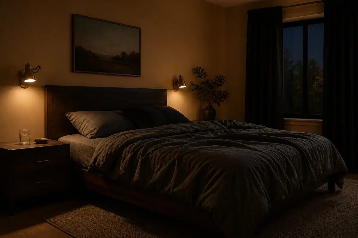
1 Bedroom Photo
Butternut (6389) offers a starting mood rather than a finished formula: Its warm classification can feel inviting beside tactile, natural materials. Test it under gentle morning light and low evening lamps.

A moody bedroom painted in Butternut
@mybudgetrecipes
1 Living Room Photo
1 living room image place Butternut (6389) in a space shaped by conversation, quiet evenings and changing daylight. An LRV of 37.1 lets the color hold its identity across both brighter and more shaded parts of the room.

A traditional living room painted in Butternut
@mybudgetrecipes
1 Patio Photo
1 generated visualization explores how the color might shape the finished space. Together they show Butternut (6389) as inspiration rather than a promise of an identical result.

contemporary patio featuring Butternut by Sherwin-Williams
@mybudgetrecipes
1 House Photo
The façade’s movement through sun, shade and season can draw different notes from Butternut (6389). The beige hue classifications suggest the subtle directions the color may take as the room changes.

Butternut color — rustic modern house inspiration
@mybudgetrecipes
1 Mudroom Photo
Butternut (6389) brings its yellow character into a practical threshold where the outdoors enters the home. Its midtone saturation keeps the color expressive without letting it dominate every surface around it.

Butternut paint in a tiny mudroom
@mybudgetrecipes
1 Kitchen Photo
1 generated visualization explores how the color might shape the finished space. Together they show Butternut (6389) as inspiration rather than a promise of an identical result.

Butternut — earthy kitchen
@mybudgetrecipes
Expert Perspectives
Articles and features from across our network of home and design sites.
Coordinating Colors


At LRV 83 vs 37, Dover White is decisively the brighter choice.

Retro Mint reflects far more light (LRV 54 vs 37), opening up a space where Butternut encloses it.


Butternut reflects far more light (LRV 37 vs 8), opening up a space where Perle Noir encloses it.
Trim Color
At LRV 83 vs 37, Dover White is decisively the brighter choice.
Similar Colors


Their light reflectance is nearly identical (LRV 39 vs 37), so neither reads brighter in a room.

With LRVs of 37 and 34, the two reflect almost the same amount of light.


A 3-point LRV gap (37 vs 34) makes Butternut the marginally brighter of the two.


Their light reflectance is nearly identical (LRV 38 vs 37), so neither reads brighter in a room.


A 4-point LRV gap (41 vs 37) makes Harvest Gold the marginally brighter of the two.


A 5-point LRV gap (37 vs 32) makes Butternut the marginally brighter of the two.


With LRVs of 37 and 37, the two reflect almost the same amount of light.
Complementary Colors


Butternut reflects far more light (LRV 37 vs 19), opening up a space where Labradorite encloses it.


At LRV 37 vs 3, Butternut is decisively the brighter choice.

Lavender Wisp reflects far more light (LRV 83 vs 37), opening up a space where Butternut encloses it.


At LRV 37 vs 6, Butternut is decisively the brighter choice.

At LRV 37 vs 4, Butternut is decisively the brighter choice.


At LRV 37 vs 13, Butternut is decisively the brighter choice.
Lighter Colors


A 9-point LRV gap (46 vs 37) makes Restrained Gold the marginally brighter of the two.


Independent Gold reflects far more light (LRV 50 vs 37), opening up a space where Butternut encloses it.


Interactive Cream reflects far more light (LRV 62 vs 37), opening up a space where Butternut encloses it.
Darker Colors

Monarch Gold reflects far more light (LRV NaN vs NaN), opening up a space where Butternut encloses it.

At LRV 37 vs 18, Butternut is decisively the brighter choice.


Butternut reads slightly lighter (LRV 37 vs 26), a gap that shows most in low-lit rooms.


At LRV 37 vs 25, Butternut is decisively the brighter choice.


Color Codes
Manufacturer description
This warm golden yellow carries the richness of buttered toast and autumn afternoons, settling into spaces with a gentle, inviting glow. Perfect for kitchens and dining areas, its honeyed undertones create an atmosphere of comfort and understated elegance.