
Craft Paper
Craft Paper begins as a yellow color on paper, then shifts with every surface, shadow and neighboring material. Its beige classifications hint at the directions it may take as daylight, lamps and neighboring colors move around it. Move between the room imagery, color measurements and coordinating shades to build a fuller sense of how it might live in your space.
Hex
#8A6645LRV
15.34
Craft Paper's Color Strip
Craft Paper is the seventh shade on this 7-color strip, the deepest shade in this coordinated family. As part of strip 141, these colors are curated to work together — helpful when you're deciding how light or deep to go.


Craft Paper in Rooms
Follow Craft Paper from one space to another and watch how light, scale and surrounding materials reshape its character. 10 generated visualizations explore how the color might shape a finished room.
1 Bedroom Photo
The 1 bedroom image turn a yellow swatch into something more spatial and expressive. Its midtone saturation keeps the color expressive without letting it dominate every surface around it.
A minimalist bedroom painted in Craft Paper
@mybudgetrecipes
1 Front Door Photo
The 1 front door image turn a yellow swatch into something more spatial and expressive. Its midtone saturation keeps the color expressive without letting it dominate every surface around it.

stylish front door featuring Craft Paper by Sherwin-Williams
@mybudgetrecipes
1 Home Office Photo
Viewed across 1 home office image in a focused room balancing work, concentration and comfort, Craft Paper (6125) reveals how much color depends on scale, surface and shadow. With an LRV of 15.3, it carries enough visual weight to make light, trim and texture feel especially deliberate.

Sherwin-Williams Craft Paper in a industrial home office
@mybudgetrecipes
1 Bathroom Photo
1 generated visualization explores how the color might shape the finished space. Together they show Craft Paper (6125) as inspiration rather than a promise of an identical result.

Craft Paper — coastal bathroom
@mybudgetrecipes
1 Dining Room Photo
Across 1 dining room image, Craft Paper (6125) meets natural light, candles and pendant lighting. Its warm classification can feel inviting beside tactile, natural materials.

Craft Paper paint in a elegant dining room
@mybudgetrecipes
1 Mudroom Photo
The 1 mudroom image turn a yellow swatch into something more spatial and expressive. Its midtone saturation keeps the color expressive without letting it dominate every surface around it.

Craft Paper paint in a classy mudroom
@mybudgetrecipes
1 House Photo
1 house image place Craft Paper (6125) in an exterior viewed across distance, weather and the changing sky. With an LRV of 15.3, it carries enough visual weight to make light, trim and texture feel especially deliberate.

Craft Paper color — scandinavian house inspiration
@mybudgetrecipes
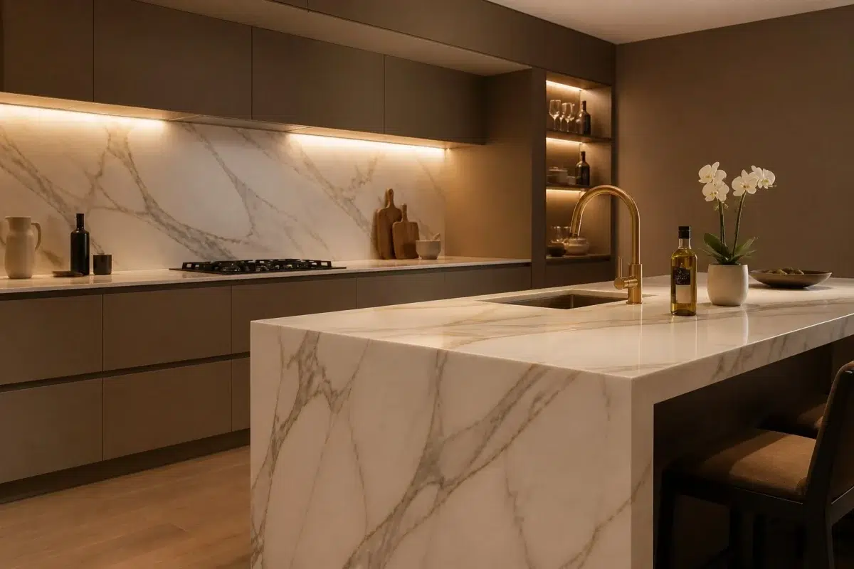
1 Kitchen Photo
Craft Paper (6125) offers a starting mood rather than a finished formula: Its warm classification can feel inviting beside tactile, natural materials. Test it under daylight, task lighting and evening pendants.

Craft Paper — modern luxury kitchen
@mybudgetrecipes
1 Patio Photo
1 patio image place Craft Paper (6125) in an outdoor room surrounded by sky, planting and open light. With an LRV of 15.3, it carries enough visual weight to make light, trim and texture feel especially deliberate.

rustic modern patio featuring Craft Paper by Sherwin-Williams
@mybudgetrecipes
1 Living Room Photo
The 1 living room image turn a yellow swatch into something more spatial and expressive. Its midtone saturation keeps the color expressive without letting it dominate every surface around it.

A contemporary living room painted in Craft Paper
@mybudgetrecipes
Expert Perspectives
Articles and features from across our network of home and design sites.
Coordinating Colors


Antique White reflects far more light (LRV 72 vs 15), opening up a space where Craft Paper encloses it.


Shoji White reflects far more light (LRV 74 vs 15), opening up a space where Craft Paper encloses it.


With LRVs of 15 and 13, the two reflect almost the same amount of light.
Trim Color
Antique White reflects far more light (LRV 72 vs 15), opening up a space where Craft Paper encloses it.
Similar Colors


Their light reflectance is nearly identical (LRV 16 vs 15), so neither reads brighter in a room.

With LRVs of 16 and 15, the two reflect almost the same amount of light.

Their light reflectance is nearly identical (LRV 15 vs 15), so neither reads brighter in a room.


Their light reflectance is nearly identical (LRV 16 vs 15), so neither reads brighter in a room.


Their light reflectance is nearly identical (LRV 18 vs 15), so neither reads brighter in a room.


With LRVs of 15 and 13, the two reflect almost the same amount of light.

With LRVs of 15 and 14, the two reflect almost the same amount of light.

Their light reflectance is nearly identical (LRV 17 vs 15), so neither reads brighter in a room.

Their light reflectance is nearly identical (LRV 17 vs 15), so neither reads brighter in a room.
Complementary Colors


A 9-point LRV gap (15 vs 6) makes Craft Paper the marginally brighter of the two.


At LRV 34 vs 15, Debonair is decisively the brighter choice.


A 8-point LRV gap (15 vs 7) makes Craft Paper the marginally brighter of the two.


A 4-point LRV gap (15 vs 11) makes Craft Paper the marginally brighter of the two.


A 9-point LRV gap (15 vs 7) makes Craft Paper the marginally brighter of the two.


At LRV 69 vs 15, Starry Night is decisively the brighter choice.


Soulful Blue reads slightly lighter (LRV 20 vs 15), a gap that shows most in low-lit rooms.
Lighter Colors

At LRV 28 vs 15, Renwick Rose Beige is decisively the brighter choice.


Almond Roca reads slightly lighter (LRV 25 vs 15), a gap that shows most in low-lit rooms.
With LRVs of 16 and 15, the two reflect almost the same amount of light.

Sugared Almond reflects far more light (LRV 35 vs 15), opening up a space where Craft Paper encloses it.


Their light reflectance is nearly identical (LRV 18 vs 15), so neither reads brighter in a room.
Darker Colors
With LRVs of 15 and 13, the two reflect almost the same amount of light.

Craft Paper reads slightly lighter (LRV 15 vs 10), a gap that shows most in low-lit rooms.

Craft Paper reads slightly lighter (LRV 15 vs 10), a gap that shows most in low-lit rooms.

A 4-point LRV gap (15 vs 12) makes Craft Paper the marginally brighter of the two.


Craft Paper reads slightly lighter (LRV 15 vs 9), a gap that shows most in low-lit rooms.
Color Codes
Manufacturer description
This deep golden-brown evokes the rich, earthy warmth of aged kraft paper and natural burlap, grounding any space with understated sophistication. Perfect for creating an intimate, studio-like atmosphere in libraries, home offices, or accent walls that pair beautifully with warm metals and cream-colored trim.