Cordial featured
Sherwin-Williams6306

Cordial

Often used for its genuinely dark qualities, Cordial remains a staple for Sherwin-Williams designers. It is widely considered one of the best colors in its class to anchor a room without demanding the spotlight. We've gathered 10 real-home scenarios to help you visualize this color alongside our expert data.

Hex

#864C52

LRV

10.85

Find matches across brands →
Light Reflectance Value
10.85
Dark
TemperatureWarm
SaturationMidtone

Cordial's Color Strip

Cordial is the sixth shade on this 7-color strip, sitting between Rambling Rose and Fine Wine. The strip spans from Innocence at the lightest end to Fine Wine at the deepest. Strip 111 lines up the full value range so you can see exactly where this color lands among its closest relatives.

Cordial in Real Rooms

Cordial has a low LRV of 10.85 — it absorbs light and reads as a genuinely dark, enveloping color. It's neutral in temperature and , making it adaptable across different lighting conditions and room orientations. Grouped in the Red family, the photos below show it applied in a front door, bathroom, home office, bedroom, dining room, mudroom, house, living room, kitchen and patio.

1 Front Door Photo

Choosing Cordial for your entry is an exercise in restraint and elegance. It suggests a home that is well-cared for and curated, setting a high bar for the interior design before the door is even opened.

scandinavian front door featuring Cordial by Sherwin-Williams

scandinavian front door featuring Cordial by Sherwin-Williams

@mybudgetrecipes

1 Bathroom Photo

In a powder room, Cordial can be used floor-to-ceiling to create a dramatic, high-impact experience for guests. Because these rooms are small and transitional, they can handle the full intensity of the color's personality without feeling overwhelming.

Cordial — earthy bathroom

Cordial — earthy bathroom

@mybudgetrecipes

1 Home Office Photo

Cordial works exceptionally well with "warm" tech—leather desk pads, brass lamps, and wooden monitor stands. It bridges the gap between modern technology and traditional home comfort, making the office feel like part of the house.

Sherwin-Williams Cordial in a industrial home office

Sherwin-Williams Cordial in a industrial home office

@mybudgetrecipes

1 Bedroom Photo

Lighting is key in a bedroom, and Cordial reacts beautifully to dimmers. As you lower the lights for sleep, the color takes on a velvet-like quality, losing its daytime crispness in favor of a smoky, mysterious depth that is incredibly conducive to relaxation.

A traditional bedroom painted in Cordial

A traditional bedroom painted in Cordial

@mybudgetrecipes

1 Dining Room Photo

Using Cordial in the dining room allows you to go bold with your lighting fixtures. An oversized chandelier or a modern sculptural pendant will look even more dramatic against the rich, steady background of this particular shade.

Cordial paint in a contemporary dining room

Cordial paint in a contemporary dining room

@mybudgetrecipes

1 Mudroom Photo

The depth of Cordial is a secret weapon against the "dirty" look that many light-colored mudrooms eventually suffer from. It retains its freshness and intentionality even when it's not perfectly clean, which is essential for an active family.

Cordial paint in a classy mudroom

Cordial paint in a classy mudroom

@mybudgetrecipes

1 House Photo

Using Cordial on an exterior allows you to be more creative with your landscaping. The color provides a dark, rich backdrop that makes the greens of boxwoods or the colors of perennials look much more vivid and professional.

Cordial color — maximalist house inspiration

Cordial color — maximalist house inspiration

@mybudgetrecipes

1 Living Room Photo

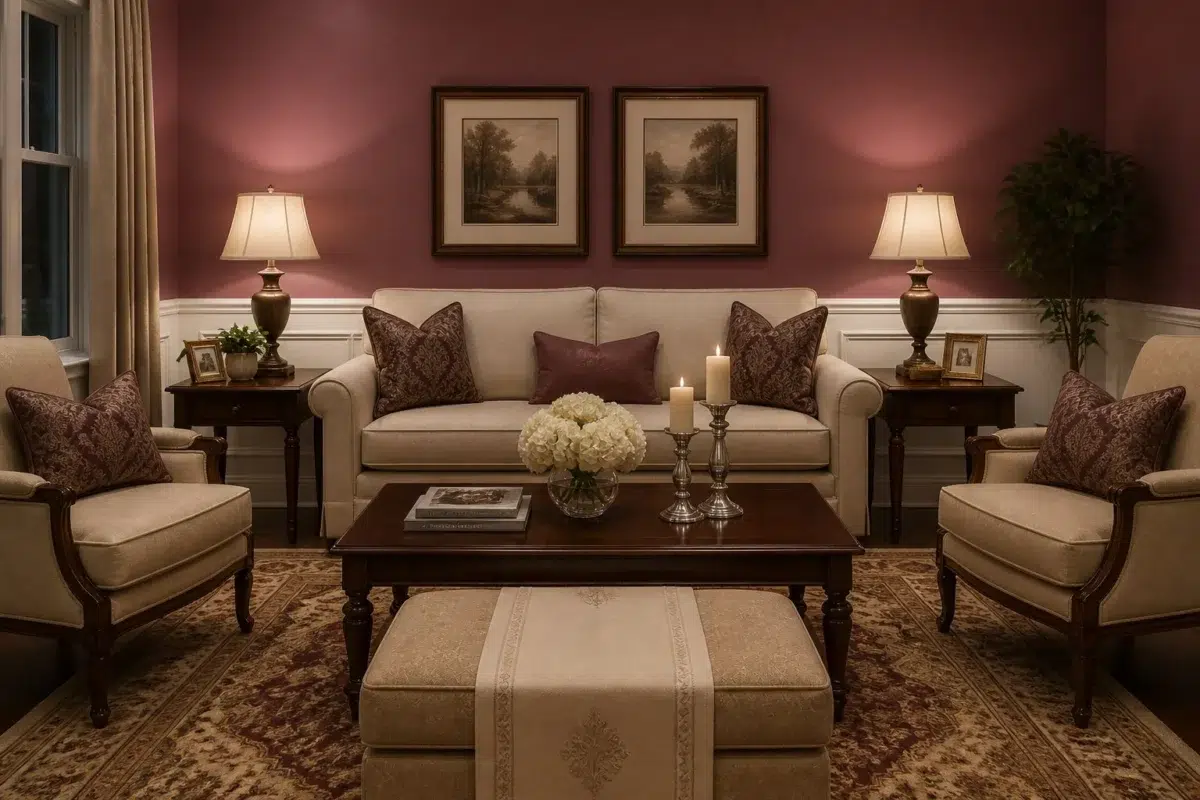
Cordial anchors the living room with a quiet, architectural confidence. Its depth shifts subtly through the day — cooler in the crisp morning light and significantly warmer by lamplight in the evening — making it a natural fit for a space meant for both high-energy gathering and silent unwinding. To maximize the effect, layer in natural white oak, heavy linen, and soft metallics to let the color truly breathe.

A traditional living room painted in Cordial

A traditional living room painted in Cordial

@mybudgetrecipes

1 Kitchen Photo

Cordial in a kitchen reads differently from how it might anywhere else — the hard surfaces, task lighting, and constant activity give it more to work against, and it holds up beautifully. It doesn't compete with the colors of food or the texture of countertops; instead, it frames them with a professional finish.

Cordial — industrial kitchen

Cordial — industrial kitchen

@mybudgetrecipes

1 Patio Photo

Cordial on a patio surface or garden wall creates a visual anchor that ties together furniture, plantings, and architecture. It reads as intentional in a way that natural wood or stone alone rarely achieves, providing a polished "finished" look to the landscape.

Cordial — boho patio

Cordial — boho patio

@mybudgetrecipes

Coordinating Colors

Cordial
Ibis White
Cordial vs Ibis White
Cordial
Ibis White
Sherwin-Williams
Cordial
6306 · LRV 11
Sherwin-Williams
Ibis White
7000 · LRV 84

At LRV 84 vs 11, Ibis White is decisively the brighter choice.

Cordial
Origami White
Cordial vs Origami White
Cordial
Origami White
Sherwin-Williams
Cordial
6306 · LRV 11
Sherwin-Williams
Origami White
7636 · LRV 76

Origami White reflects far more light (LRV 76 vs 11), opening up a space where Cordial encloses it.

Cordial
Dry Dock
Cordial vs Dry Dock
Cordial
Dry Dock
Sherwin-Williams
Cordial
6306 · LRV 11
Sherwin-Williams
Dry Dock
7502 · LRV 28

At LRV 28 vs 11, Dry Dock is decisively the brighter choice.

Trim Color

Cordial
Ibis White
Cordial vs Ibis White
Cordial
Ibis White
Sherwin-Williams
Cordial
6306 · LRV 11
Sherwin-Williams
Ibis White
7000 · LRV 84

At LRV 84 vs 11, Ibis White is decisively the brighter choice.

Similar Colors

Aged Wine
Cordial
Aged Wine vs Cordial
Aged Wine
Cordial
Sherwin-Williams
Aged Wine
6299 · LRV 13
Sherwin-Williams
Cordial
6306 · LRV 11

Their light reflectance is nearly identical (LRV 13 vs 11), so neither reads brighter in a room.

Cordial
Kirsch Red
Cordial vs Kirsch Red
Cordial
Kirsch Red
Sherwin-Williams
Cordial
6306 · LRV 11
Sherwin-Williams
Kirsch Red
6313 · LRV 12

With LRVs of 12 and 11, the two reflect almost the same amount of light.

Cordial
Cordial vs Toile Red
Cordial
Toile Red
Sherwin-Williams
Cordial
6306 · LRV 11
Sherwin-Williams
Toile Red
0006 · LRV 12

Their light reflectance is nearly identical (LRV 12 vs 11), so neither reads brighter in a room.

Alaea
Cordial
Alaea vs Cordial
Alaea
Cordial
Sherwin-Williams
Alaea
7579 · LRV 12
Sherwin-Williams
Cordial
6306 · LRV 11

With LRVs of 12 and 11, the two reflect almost the same amount of light.

Cordial
Cordial vs Luxurious Red
Cordial
Luxurious Red
Sherwin-Williams
Cordial
6306 · LRV 11
Sherwin-Williams
Luxurious Red
6314 · LRV 8

With LRVs of 11 and 8, the two reflect almost the same amount of light.

Cordial
Cordial vs Juneberry
Cordial
Juneberry
Sherwin-Williams
Cordial
6306 · LRV 11
Sherwin-Williams
Juneberry
6573 · LRV 9

With LRVs of 11 and 9, the two reflect almost the same amount of light.

Cordial
Cordial vs Rambling Rose
Cordial
Rambling Rose
Sherwin-Williams
Cordial
6306 · LRV 11
Sherwin-Williams
Rambling Rose
6305 · LRV 15

Rambling Rose reads slightly lighter (LRV 15 vs 11), a gap that shows most in low-lit rooms.

Berry Bush
Cordial
Berry Bush vs Cordial
Berry Bush
Cordial
Sherwin-Williams
Berry Bush
6292 · LRV 14
Sherwin-Williams
Cordial
6306 · LRV 11

Their light reflectance is nearly identical (LRV 14 vs 11), so neither reads brighter in a room.

Cordial
Fine Wine
Cordial vs Fine Wine
Cordial
Fine Wine
Sherwin-Williams
Cordial
6306 · LRV 11
Sherwin-Williams
Fine Wine
6307 · LRV 7

Cordial reads slightly lighter (LRV 11 vs 7), a gap that shows most in low-lit rooms.

Cordial
Rembrandt Ruby
Cordial vs Rembrandt Ruby
Cordial
Rembrandt Ruby
Sherwin-Williams
Cordial
6306 · LRV 11
Sherwin-Williams
Rembrandt Ruby
0033 · LRV 13

With LRVs of 13 and 11, the two reflect almost the same amount of light.

Complementary Colors

Cordial
Mountain Air
Cordial vs Mountain Air
Cordial
Mountain Air
Sherwin-Williams
Cordial
6306 · LRV 11
Sherwin-Williams
Mountain Air
6224 · LRV 73

Mountain Air reflects far more light (LRV 73 vs 11), opening up a space where Cordial encloses it.

Cordial
Niebla Azul
Cordial vs Niebla Azul
Cordial
Niebla Azul
Sherwin-Williams
Cordial
6306 · LRV 11
Sherwin-Williams
Niebla Azul
9137 · LRV 53

Niebla Azul reflects far more light (LRV 53 vs 11), opening up a space where Cordial encloses it.

Cordial
Silver Lake
Cordial vs Silver Lake
Cordial
Silver Lake
Sherwin-Williams
Cordial
6306 · LRV 11
Sherwin-Williams
Silver Lake
9633 · LRV 53

At LRV 53 vs 11, Silver Lake is decisively the brighter choice.

Cordial
Riverway
Cordial vs Riverway
Cordial
Riverway
Sherwin-Williams
Cordial
6306 · LRV 11
Sherwin-Williams
Riverway
6222 · LRV 16

A 5-point LRV gap (16 vs 11) makes Riverway the marginally brighter of the two.

Cordial
Glass Bead
Cordial vs Glass Bead
Cordial
Glass Bead
Sherwin-Williams
Cordial
6306 · LRV 11
Sherwin-Williams
Glass Bead
6805 · LRV 77

At LRV 77 vs 11, Glass Bead is decisively the brighter choice.

Cordial
Morning at Sea
Cordial vs Morning at Sea
Cordial
Morning at Sea
Sherwin-Williams
Cordial
6306 · LRV 11
Sherwin-Williams
Morning at Sea
9634 · LRV 29

Morning at Sea reflects far more light (LRV 29 vs 11), opening up a space where Cordial encloses it.

Calico
Cordial
Calico vs Cordial
Calico
Cordial
Sherwin-Williams
Calico
0017 · LRV 35
Sherwin-Williams
Cordial
6306 · LRV 11

At LRV 35 vs 11, Calico is decisively the brighter choice.

Lighter Colors

Audrey's Blush
Cordial
Audrey's Blush vs Cordial
Audrey's Blush
Cordial
Sherwin-Williams
Audrey's Blush
9001 · LRV 26
Sherwin-Williams
Cordial
6306 · LRV 11

Audrey's Blush reflects far more light (LRV 26 vs 11), opening up a space where Cordial encloses it.

Carley's Rose
Cordial
Carley's Rose vs Cordial
Carley's Rose
Cordial
Sherwin-Williams
Carley's Rose
9002 · LRV 22
Sherwin-Williams
Cordial
6306 · LRV 11

A 11-point LRV gap (22 vs 11) makes Carley's Rose the marginally brighter of the two.

Aged Wine
Cordial
Aged Wine vs Cordial
Aged Wine
Cordial
Sherwin-Williams
Aged Wine
6299 · LRV 13
Sherwin-Williams
Cordial
6306 · LRV 11

Their light reflectance is nearly identical (LRV 13 vs 11), so neither reads brighter in a room.

Cordial
Cordial vs Rambling Rose
Cordial
Rambling Rose
Sherwin-Williams
Cordial
6306 · LRV 11
Sherwin-Williams
Rambling Rose
6305 · LRV 15

Rambling Rose reads slightly lighter (LRV 15 vs 11), a gap that shows most in low-lit rooms.

Cordial
Cordial vs Redbud
Cordial
Redbud
Sherwin-Williams
Cordial
6306 · LRV 11
Sherwin-Williams
Redbud
6312 · LRV 18

Redbud reads slightly lighter (LRV 18 vs 11), a gap that shows most in low-lit rooms.

Darker Colors

Cordial
Fine Wine
Cordial vs Fine Wine
Cordial
Fine Wine
Sherwin-Williams
Cordial
6306 · LRV 11
Sherwin-Williams
Fine Wine
6307 · LRV 7

Cordial reads slightly lighter (LRV 11 vs 7), a gap that shows most in low-lit rooms.

Cordial
Marooned
Cordial vs Marooned
Cordial
Marooned
Sherwin-Williams
Cordial
6306 · LRV 11
Sherwin-Williams
Marooned
6020 · LRV 4

A 7-point LRV gap (11 vs 4) makes Cordial the marginally brighter of the two.

Color Codes

HEX#864C52
RGB134, 76, 82
HSL354° 28% 41%
CMYK0 43 39 47
CIE LabL: 39.3 a: 25.2 b: 7.2
XYZX: 13.94 Y: 10.85 Z: 9.34
Strip111 pos. C6