
Create
At first glance, Create belongs to the neutral family; in a room, light and context can make it far more elusive. Its neutral temperature leaves room for surrounding materials and light to pull the color warmer or cooler. Because screens flatten both light and texture, sample the paint beside the finishes that will ultimately surround it.
Hex
#C9CABFLRV
58.44
Create in Rooms
Follow Create from one space to another and watch how light, scale and surrounding materials reshape its character. 10 generated visualizations explore how the color might shape a finished room.
1 Front Door Photo
Viewed across 1 front door image in a small architectural moment with an outsized first impression, Create (9646) reveals how much color depends on scale, surface and shadow. An LRV of 58.4 lets the color hold its identity across both brighter and more shaded parts of the room.
minimalist front door featuring Create by Sherwin-Williams
@mybudgetrecipes
1 Home Office Photo
Its place within Emerald Designer Edition - Rustic + Refined hints at the range of palettes it can inhabit. In this setting, let daylight beside desk lamps and screen glow and wood, paper, shelving and upholstered seating guide the final sample decision.

Sherwin-Williams Create in a art deco home office
@mybudgetrecipes
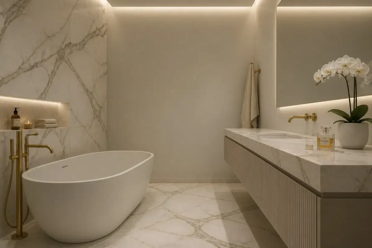
1 Bathroom Photo
1 bathroom image trace Create (9646) through the contrast between bright mornings and quieter evening light. Its place within Emerald Designer Edition - Rustic + Refined hints at the range of palettes it can inhabit.

Create — modern luxury bathroom
@mybudgetrecipes
1 Dining Room Photo
Across 1 dining room image, Create (9646) meets natural light, candles and pendant lighting. Its neutral temperature gives the surrounding palette unusual influence over the final mood.

Create paint in a mid century dining room
@mybudgetrecipes
1 Bedroom Photo
The slower pace of morning and night can draw different notes from Create (9646). The grey hue classifications suggest the subtle directions the color may take as the room changes.

A boho bedroom painted in Create
@mybudgetrecipes
1 House Photo
1 house image trace Create (9646) through the façade’s movement through sun, shade and season. Its place within Emerald Designer Edition - Rustic + Refined hints at the range of palettes it can inhabit.

Create color — scandinavian house inspiration
@mybudgetrecipes
1 Patio Photo
Viewed across 1 patio image in an outdoor room surrounded by sky, planting and open light, Create (9646) reveals how much color depends on scale, surface and shadow. An LRV of 58.4 lets the color hold its identity across both brighter and more shaded parts of the room.

aesthetic patio featuring Create by Sherwin-Williams
@mybudgetrecipes
1 Living Room Photo
The 1 living room image turn a neutral swatch into something more spatial and expressive. Its neutral temperature gives the surrounding palette unusual influence over the final mood.

A scandinavian living room painted in Create
@mybudgetrecipes
1 Mudroom Photo
Its place within Emerald Designer Edition - Rustic + Refined hints at the range of palettes it can inhabit. In this setting, let doorway light and the softer illumination of an internal passage and flooring, storage, timber, baskets and hardware guide the final sample decision.

Create paint in a small mudroom
@mybudgetrecipes
1 Kitchen Photo
Create (9646) moves through 1 kitchen image without becoming a fixed prescription for the room. Its neutral temperature gives the surrounding palette unusual influence over the final mood.

Create — scandinavian kitchen
@mybudgetrecipes
Expert Perspectives
Articles and features from across our network of home and design sites.
Coordinating Colors


At LRV 58 vs 10, Create is decisively the brighter choice.


Create reflects far more light (LRV 58 vs 29), opening up a space where Morning at Sea encloses it.
Similar Colors


Their light reflectance is nearly identical (LRV 58 vs 58), so neither reads brighter in a room.


With LRVs of 61 and 58, the two reflect almost the same amount of light.


Their light reflectance is nearly identical (LRV 60 vs 58), so neither reads brighter in a room.


With LRVs of 59 and 58, the two reflect almost the same amount of light.


A 4-point LRV gap (63 vs 58) makes Conservative Gray the marginally brighter of the two.


With LRVs of 60 and 58, the two reflect almost the same amount of light.


With LRVs of 60 and 58, the two reflect almost the same amount of light.


A 6-point LRV gap (64 vs 58) makes Filmy Green the marginally brighter of the two.
Complementary Colors

At LRV 58 vs 12, Create is decisively the brighter choice.


At LRV 76 vs 58, Lady's Slipper is decisively the brighter choice.


Create reflects far more light (LRV 58 vs 16), opening up a space where Forget-Me-Not encloses it.

At LRV 58 vs 5, Create is decisively the brighter choice.


At LRV 58 vs 29, Create is decisively the brighter choice.
Lighter Colors
With LRVs of 60 and 58, the two reflect almost the same amount of light.
With LRVs of 60 and 58, the two reflect almost the same amount of light.


Silverpointe reads slightly lighter (LRV 64 vs 58), a gap that shows most in low-lit rooms.


At LRV 72 vs 58, Fleur De Sel is decisively the brighter choice.
Darker Colors


A 7-point LRV gap (58 vs 51) makes Create the marginally brighter of the two.


Create reflects far more light (LRV 58 vs 31), opening up a space where Green Onyx encloses it.


At LRV 58 vs 41, Create is decisively the brighter choice.


At LRV 58 vs 38, Create is decisively the brighter choice.


Create reflects far more light (LRV 58 vs 41), opening up a space where Clary Sage encloses it.
Color Codes
Manufacturer description
This serene, barely-there neutral floats between warm and cool, creating an almost ethereal backdrop that lets your furnishings and art take center stage. Perfect for bedrooms, bathrooms, or living spaces where you want a calm, unobtrusive foundation that feels both modern and timeless.