
Ripe Olive
Sherwin-Williams's Ripe Olive is a green shade whose quieter details emerge through comparison. A muted saturation softens the hue, giving it a quieter quality that can sit comfortably among layered neutrals. 37 sourced room photos sit alongside 7 generated visualizations.
Hex
#44483DLRV
6.20
Ripe Olive's Color Strip
Ripe Olive is the seventh shade on this 7-color strip, the deepest shade in this coordinated family. Strip 217 puts these related shades in sequence, making it simple to find the tone that suits your room.


Ripe Olive in Rooms
Follow Ripe Olive from one space to another and watch how light, scale and surrounding materials reshape its character. 37 sourced room photos sit alongside 7 generated visualizations.
7 Bathroom Photos
Ripe Olive (6209) moves through 7 bathroom images without becoming a fixed prescription for the room. Its neutral temperature gives the surrounding palette unusual influence over the final mood.
Bathroom walls in Ripe Olive create a sophisticated, earthy retreat.
@mybudgetrecipes
4 Bedroom Photos
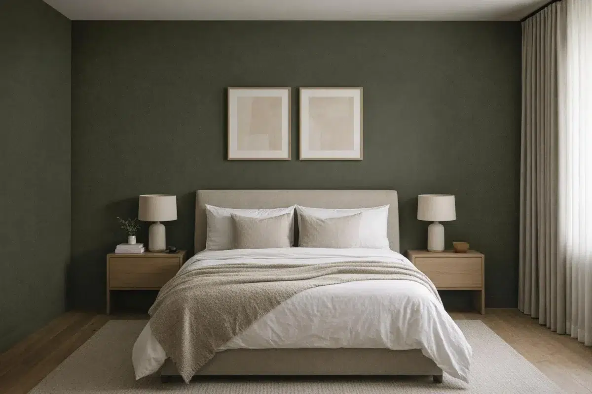
3 sourced photos are joined by 1 generated visualization, offering both observed and imagined settings. Together they show Ripe Olive (6209) as inspiration rather than a promise of an identical result.

Bedroom walls wrapped in Ripe Olive provide rich, grounding warmth.
@mybudgetrecipes

Bedroom walls in Ripe Olive create a grounding, naturally peaceful sleeping environment.
@thewoodlandbungalow

Wooden headboard pairs with Ripe Olive walls for warmth and layered texture.
@thewoodlandbungalow

Bedding and accessories echo the muted tones of this Ripe Olive bedroom.
@taggeboxlane
2 Front Door Photos
Its place within 2020 Alive hints at the range of palettes it can inhabit. In this setting, let direct sun, porch shade and evening exterior light and hardware, glazing, masonry, timber and surrounding trim guide the final sample decision.

Front door finished in Ripe Olive makes a bold, inviting statement.
@mybudgetrecipes

Front door in Ripe Olive makes a bold architectural statement for this residence.
@murpheybeckerart
2 Home Office Photos
1 sourced photo is joined by 1 generated visualization, offering both observed and imagined settings. Together they show Ripe Olive (6209) as inspiration rather than a promise of an identical result.

Home office walls in Ripe Olive foster focus and creative inspiration.
@mybudgetrecipes

Home office walls in Ripe Olive establish a calming, focused work environment.
@gaspworthyinteriors
5 House Photos
These 5 house images show how Ripe Olive (6209) can sit beside roofing, masonry, timber, planting and trim. The green, grey hue classifications suggest the subtle directions the color may take as the room changes.

House exterior painted in Ripe Olive delivers timeless curb appeal.
@mybudgetrecipes

Black shutters and trim contrast striking exterior siding in Ripe Olive.
@hoorayhouse

Landscaping frames a home's exterior painted in rich, sophisticated Ripe Olive.
@mikespropaintinganddrywall

Brick chimney and white trim pop against house siding in Ripe Olive.
@brookeaquino

Exterior cladding in Ripe Olive brings understated elegance to this residential facade.
@lakehousefixer
1 Kitchen Photo
In a hardworking room where color meets movement and strong surfaces, the most interesting quality of Ripe Olive (6209) may be the way it responds to stone, timber, tile and metal finishes. The green, grey hue classifications suggest the subtle directions the color may take as the room changes.

Kitchen walls in Ripe Olive create a warm, sophisticated backdrop for cooking.
@mybudgetrecipes
6 Living Room Photos
5 sourced photos are joined by 1 generated visualization, offering both observed and imagined settings. Together they show Ripe Olive (6209) as inspiration rather than a promise of an identical result.

Living room accent wall painted in Ripe Olive anchors the seating arrangement.
@mybudgetrecipes
12 Kitchen Cabinets Photos
Ripe Olive (6209) offers a starting mood rather than a finished formula: Its neutral temperature gives the surrounding palette unusual influence over the final mood. Test it under light moving across doors, rails and recessed panels.

Lower cabinets dressed in Ripe Olive bring depth and modern elegance to the kitchen.
@rameyhomesolutions
5 Misc Photos
These 5 misc images show how Ripe Olive (6209) can sit beside a changing mix of architectural details and personal finishes. The green, grey hue classifications suggest the subtle directions the color may take as the room changes.

Painted walls in Ripe Olive deepen the room's character and visual interest.
@jodylynn70

Dresser painted in Ripe Olive transforms a bedroom with muted, earthy sophistication.
@prepped_and_primed

Wooden furniture finished in Ripe Olive gains a refined, gallery-worthy appearance.
@rusticowlfurnishings

Shiplap paneling finished in Ripe Olive creates textured depth on this accent wall.
@jennasuedesign

This accent wall in Ripe Olive grounds the room with calm, earthy sophistication.
@jennasuedesign
Expert Perspectives
Articles and features from across our network of home and design sites.
Coordinating Colors


At LRV 77 vs 6, Spare White is decisively the brighter choice.


Oyster White reflects far more light (LRV 72 vs 6), opening up a space where Ripe Olive encloses it.


Green Onyx reflects far more light (LRV 31 vs 6), opening up a space where Ripe Olive encloses it.
Trim Color
At LRV 77 vs 6, Spare White is decisively the brighter choice.
Similar Colors


With LRVs of 6 and 6, the two reflect almost the same amount of light.


With LRVs of 7 and 6, the two reflect almost the same amount of light.


Their light reflectance is nearly identical (LRV 8 vs 6), so neither reads brighter in a room.


Their light reflectance is nearly identical (LRV 7 vs 6), so neither reads brighter in a room.


With LRVs of 8 and 6, the two reflect almost the same amount of light.


Their light reflectance is nearly identical (LRV 6 vs 5), so neither reads brighter in a room.


Their light reflectance is nearly identical (LRV 6 vs 5), so neither reads brighter in a room.


Their light reflectance is nearly identical (LRV 7 vs 6), so neither reads brighter in a room.


Their light reflectance is nearly identical (LRV 6 vs 4), so neither reads brighter in a room.


With LRVs of 6 and 6, the two reflect almost the same amount of light.
Complementary Colors

A 10-point LRV gap (16 vs 6) makes Wood Violet the marginally brighter of the two.


At LRV 28 vs 6, Berry Cream is decisively the brighter choice.

A 6-point LRV gap (12 vs 6) makes Purple Passage the marginally brighter of the two.

Plummy reads slightly lighter (LRV 11 vs 6), a gap that shows most in low-lit rooms.


Elation reflects far more light (LRV 72 vs 6), opening up a space where Ripe Olive encloses it.


Inspired Lilac reflects far more light (LRV 71 vs 6), opening up a space where Ripe Olive encloses it.


Forget-Me-Not reads slightly lighter (LRV 16 vs 6), a gap that shows most in low-lit rooms.
Lighter Colors


A 7-point LRV gap (13 vs 6) makes Night Owl the marginally brighter of the two.


A 6-point LRV gap (12 vs 6) makes Pewter Green the marginally brighter of the two.
Their light reflectance is nearly identical (LRV 8 vs 6), so neither reads brighter in a room.


Dried Thyme reflects far more light (LRV 21 vs 6), opening up a space where Ripe Olive encloses it.


Rosemary reads slightly lighter (LRV 14 vs 6), a gap that shows most in low-lit rooms.
Color Codes
Manufacturer description
Make a bold and colorful statement with this deep green. With its blue-gray undertones, this neutral can offer a well-lit space an intriguing, sophisticated mood.