
Retreat
Retreat is a Green paint color from Sherwin-Williams, but its character reaches beyond a single label. Its grey classifications hint at the directions it may take as daylight, lamps and neighboring colors move around it. Move between the room imagery, color measurements and coordinating shades to build a fuller sense of how it might live in your space.
Hex
#7A8076LRV
20.88
Retreat's Color Strip
Retreat is the fifth shade on this 7-color strip, sitting between Acacia Haze and Pewter Green. The strip spans from Sea Salt at the lightest end to Ripe Olive at the deepest. Strip 217 makes it easy to compare shades side by side and find the right depth for your space.


Retreat in Rooms
Follow Retreat from one space to another and watch how light, scale and surrounding materials reshape its character. 48 sourced room photos sit alongside 7 generated visualizations.
8 Living Room Photos
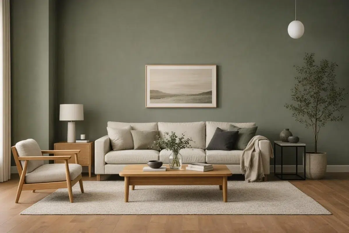
Retreat (6207) can change noticeably under the movement from window light to lamplight. Sample it beside the finishes that will remain in the room.
Living room walls in Retreat create a calm, sophisticated gathering space.
@mybudgetrecipes
8 Bedroom Photos
Retreat (6207) brings its green character into a room designed around rest, softness and retreat. Its muted saturation softens the color’s edges, making texture and shadow part of the composition.

Soft bedroom walls create a serene retreat in calming neutral tones.
@mybudgetrecipes
1 Kitchen Photo
Its place within Rejuvenation - Spring/Summer 2022 hints at the range of palettes it can inhabit. In this setting, let daylight, task lighting and evening pendants and stone, timber, tile and metal finishes guide the final sample decision.

Kitchen cabinetry in Retreat delivers understated elegance with warm gray sophistication.
@mybudgetrecipes
10 Bathroom Photos
Retreat (6207) moves through 10 bathroom images without becoming a fixed prescription for the room. Its neutral temperature gives the surrounding palette unusual influence over the final mood.

Bathroom walls wrapped in Retreat gray provide a spa-like tranquil atmosphere.
@mybudgetrecipes
1 Home Office Photo
Its place within Rejuvenation - Spring/Summer 2022 hints at the range of palettes it can inhabit. In this setting, let daylight beside desk lamps and screen glow and wood, paper, shelving and upholstered seating guide the final sample decision.

Desk and shelving in Retreat establish a focused, neutral workspace.
@mybudgetrecipes
7 House Photos
6 sourced photos are joined by 1 generated visualization, offering both observed and imagined settings. Together they show Retreat (6207) as inspiration rather than a promise of an identical result.

Exterior siding in Retreat presents a refined, cohesive home facade.
@mybudgetrecipes
1 Front Door Photo
1 generated visualization explores how the color might shape the finished space. Together they show Retreat (6207) as inspiration rather than a promise of an identical result.

Front door painted in Retreat makes a subtle architectural statement.
@mybudgetrecipes
9 Misc Photos
Viewed across 9 misc images in an assortment of spaces that reveals the color outside a single design formula, Retreat (6207) reveals how much color depends on scale, surface and shadow. An LRV of 20.9 lets the color hold its identity across both brighter and more shaded parts of the room.

Utility room walls in Retreat maximize brightness with soft neutral coverage.
@athomeonwhiteave
1 Dining Room Photo
Retreat (6207) brings its green character into a gathering space that can move from daylight to ceremony. Its muted saturation softens the color’s edges, making texture and shadow part of the composition.

Dining room walls painted in Retreat establish an inviting, serene gathering space.
@bbrengel
9 Kitchen Cabinets Photos
The repetition of doors, drawers and shadow lines can draw different notes from Retreat (6207). The grey hue classifications suggest the subtle directions the color may take as the room changes.

Kitchen cabinetry painted Retreat brings soft sophistication to everyday cooking spaces.
@sbsdesignsatl
Expert Perspectives
Articles and features from across our network of home and design sites.
Coordinating Colors


Spare White reflects far more light (LRV 77 vs 21), opening up a space where Retreat encloses it.


At LRV 76 vs 21, Origami White is decisively the brighter choice.

Verdigreen reflects far more light (LRV 34 vs 21), opening up a space where Retreat encloses it.
Trim Color
Spare White reflects far more light (LRV 77 vs 21), opening up a space where Retreat encloses it.
Similar Colors


Their light reflectance is nearly identical (LRV 21 vs 21), so neither reads brighter in a room.


Their light reflectance is nearly identical (LRV 21 vs 20), so neither reads brighter in a room.


Their light reflectance is nearly identical (LRV 24 vs 21), so neither reads brighter in a room.


Their light reflectance is nearly identical (LRV 23 vs 21), so neither reads brighter in a room.


Their light reflectance is nearly identical (LRV 21 vs 19), so neither reads brighter in a room.


With LRVs of 22 and 21, the two reflect almost the same amount of light.


With LRVs of 23 and 21, the two reflect almost the same amount of light.
Complementary Colors

Retreat reads slightly lighter (LRV 21 vs 16), a gap that shows most in low-lit rooms.


Berry Cream reads slightly lighter (LRV 28 vs 21), a gap that shows most in low-lit rooms.


At LRV 81 vs 21, Feathery Lilac is decisively the brighter choice.


At LRV 71 vs 21, Inspired Lilac is decisively the brighter choice.
Lighter Colors


Tin Lizzie reads slightly lighter (LRV 30 vs 21), a gap that shows most in low-lit rooms.


Unusual Gray reflects far more light (LRV 38 vs 21), opening up a space where Retreat encloses it.


Acacia Haze reads slightly lighter (LRV 32 vs 21), a gap that shows most in low-lit rooms.


Oyster Bay reflects far more light (LRV 44 vs 21), opening up a space where Retreat encloses it.
Darker Colors


Retreat reads slightly lighter (LRV 21 vs 13), a gap that shows most in low-lit rooms.


At LRV 21 vs 7, Retreat is decisively the brighter choice.
Color Codes
Manufacturer description
This muted green with blue-gray undertones will fill your space with the fresh feeling of mountain air. An uplifting shade for bedrooms and kitchen cabinets.