
Comfort Gray
Comfort Gray is a versatile and reflective Green from Sherwin-Williams. Our real-world data shows it is a primary choice when homeowners need to provide a clean, timeless feel that works across various lighting conditions. Below, you'll find 24 examples of this shade in actual homes along with suggested color relationships.
Hex
#BEC3BB
LRV
53.57
Comfort Gray's Color Strip
Comfort Gray is the second shade on this 7-color strip, sitting between Sea Salt and Oyster Bay. The strip spans from Sea Salt at the lightest end to Ripe Olive at the deepest. Strip 217 puts these related shades in sequence, making it simple to find the tone that suits your room.


Comfort Gray in Real Rooms
Comfort Gray has a medium-high LRV of 53.57 — present enough to register on the wall without making a room feel heavy. It's neutral in temperature and , making it adaptable across different lighting conditions and room orientations. Grouped in the Green family, the photos below show it applied in a bathroom, bedroom, front door, home office, house, kitchen, living room, misc, dining room and kitchen cabinets.
4 Bathroom Photos
Bathrooms test color in specific ways — task lighting, tile grout, and chrome or brass fixtures all compete for attention. Comfort Gray holds its own against all of it, and tends to photograph even better than it reads in person.
Bathroom tile and walls coordinate seamlessly in Comfort Gray.
@mybudgetrecipes

Bathroom walls in Comfort Gray complement tile and fixtures beautifully.
@llbinteriors

Tile and walls in Comfort Gray create cohesive spa-like bathroom.
@_jordannabcole

Bathroom walls in Comfort Gray blend with white subway tile seamlessly.
@the_dani_design
2 Bedroom Photos
A bedroom finished in Comfort Gray rewards the time you spend in it. The color is deep enough to feel intentional and luxurious, but not so saturated that it becomes visually tiring over time — it strikes the perfect balance for a space meant for both deep sleep and the slow, reflective hours before it.

Bedroom walls in Comfort Gray create a serene, restful sleeping environment.
@mybudgetrecipes

Bedroom walls in Comfort Gray provide calming backdrop for restful sleep.
@the.painted.piano
1 Front Door Photo
Choosing Comfort Gray for your entry is an exercise in restraint and elegance. It suggests a home that is well-cared for and curated, setting a high bar for the interior design before the door is even opened.

Front door painted in Comfort Gray makes a sophisticated neutral statement.
@mybudgetrecipes
1 Home Office Photo
To create a "library" feel in your home office, use Comfort Gray on both the walls and the built-in shelving. This monochromatic approach creates a sophisticated, academic atmosphere that makes the room feel like a true destination for thought.

Home office walls dressed in Comfort Gray support focused, calm productivity.
@mybudgetrecipes
4 House Photos
Comfort Gray is particularly effective on modern-style homes with flat planes and large windows. The color emphasizes the geometry of the house, using shadows and light to create a dynamic, ever-changing facade throughout the day.

Exterior siding in Comfort Gray offers timeless curb appeal and sophistication.
@mybudgetrecipes

House exterior finished in Comfort Gray showcases versatile modern appeal.
@angiebackeast

Ceilings and walls in Comfort Gray enhance perception of spacious rooms.
@donaroseneinteriors

High ceilings paired with Comfort Gray walls amplify light and openness.
@donaroseneinteriors
1 Kitchen Photo
For smaller kitchens, Comfort Gray can be used to create a "jewel box" effect. By painting the walls and trim in this same shade, you eliminate visual breaks, making the room feel more expansive and sophisticated despite its modest footprint.

Kitchen walls in Comfort Gray provide a neutral backdrop for cabinetry.
@mybudgetrecipes
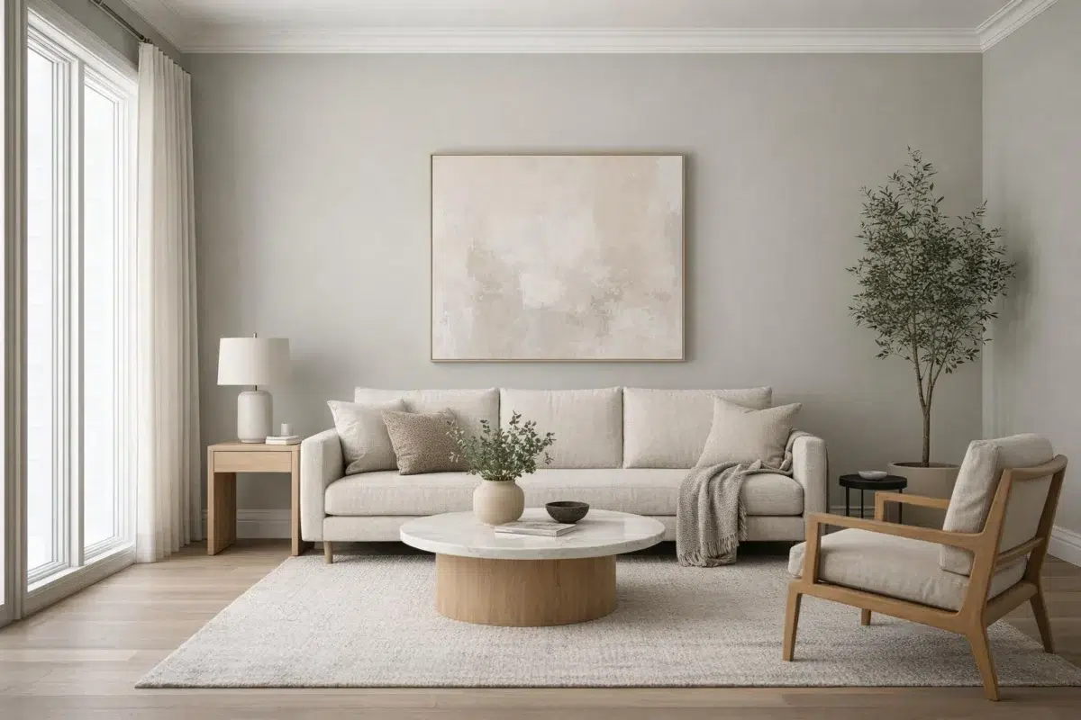
4 Living Room Photos
Choosing Comfort Gray for a main living area is a commitment to timelessness. It avoids the trend-cycle fatigue of brighter hues, offering a sophisticated neutrality that can be reimagined every few years simply by swapping out textiles or accent pillows. It is the ultimate foundation for an evolving home.

Living room walls in Comfort Gray balance warmth with understated elegance.
@mybudgetrecipes

Living room trim and walls in Comfort Gray create cohesive calm.
@jondickey

Walls throughout in Comfort Gray provide serene, adaptable backdrop space.
@jondickey

Living room walls in Comfort Gray establish peaceful, inviting atmosphere.
@endless_hacienda
5 Misc Photos
Note how Comfort Gray is used as a "ceiling color" in some of these rooms. This "fifth wall" application is a bold designer move that can make a room feel infinitely more cozy and architecturally unique.

Wall surfaces painted in Comfort Gray deliver subtle depth and refinement.
@thisoldhess

Wall color in Comfort Gray reveals muted green undertones in natural light.
@tarbe_painting_company

Interior walls in Comfort Gray display soft green-gray tones throughout.
@tarbe_painting_company

Walls painted in Comfort Gray offer sophisticated neutral sophistication.
@thedecorologist

Victorian interior walls in Comfort Gray honor period charm with restraint.
@endless_hacienda
1 Dining Room Photo
Dining rooms are often the best place to take a "color risk." By choosing Comfort Gray, you're opting for a shade that is saturated and confident, yet still refined enough to act as a neutral backdrop for colorful table linens and floral arrangements.

Dining room walls in Comfort Gray complement both traditional and contemporary furnishings.
@endless_hacienda
1 Kitchen Cabinets Photo
On kitchen cabinets, Comfort Gray adds a considered, intentional feel without demanding attention. It holds its own against both warm wood countertops and cool quartz, making it a flexible choice for the hardest-working room in the house.

Cabinet doors in Comfort Gray offer subtle sophistication in kitchen design.
@daguecommunities
Expert Perspectives
In-depth articles and real-home features from across our network of home and design sites.
Coordinating Colors


At LRV 77 vs 54, Spare White is decisively the brighter choice.


At LRV 84 vs 54, Greek Villa is decisively the brighter choice.


At LRV 54 vs 32, Comfort Gray is decisively the brighter choice.
Trim Color
At LRV 77 vs 54, Spare White is decisively the brighter choice.
Similar Colors


With LRVs of 54 and 52, the two reflect almost the same amount of light.


Silver Strand reads slightly lighter (LRV 59 vs 54), a gap that shows most in low-lit rooms.


A 4-point LRV gap (57 vs 54) makes Antimony the marginally brighter of the two.

A 7-point LRV gap (61 vs 54) makes Sea Spray the marginally brighter of the two.


Tinsmith reads slightly lighter (LRV 57 vs 54), a gap that shows most in low-lit rooms.

Their light reflectance is nearly identical (LRV 54 vs 54), so neither reads brighter in a room.


Their light reflectance is nearly identical (LRV 54 vs 51), so neither reads brighter in a room.


Create reads slightly lighter (LRV 58 vs 54), a gap that shows most in low-lit rooms.


A 4-point LRV gap (58 vs 54) makes Aloof Gray the marginally brighter of the two.


Copen Blue reads slightly lighter (LRV 59 vs 54), a gap that shows most in low-lit rooms.
Complementary Colors

At LRV 54 vs 16, Comfort Gray is decisively the brighter choice.


At LRV 54 vs 28, Comfort Gray is decisively the brighter choice.


Comfort Gray reflects far more light (LRV 54 vs 39), opening up a space where Obi Lilac encloses it.


A 5-point LRV gap (59 vs 54) makes Enchant the marginally brighter of the two.

Comfort Gray reflects far more light (LRV 54 vs 11), opening up a space where Plummy encloses it.


Feathery Lilac reflects far more light (LRV 81 vs 54), opening up a space where Comfort Gray encloses it.

At LRV 54 vs 21, Comfort Gray is decisively the brighter choice.