
Roycroft Bronze Green
Roycroft Bronze Green is a Green paint color from Sherwin-Williams, but its character reaches beyond a single label. It appears in Arts & Crafts (1880s-1910s), Dreamer and Historic Exterior Color Wall, placing it within several distinct decorating stories rather than a single fixed look. Treat the digital swatch as an opening note, then watch a physical sample from morning light through evening lamps.
Hex
#575449LRV
8.85
Roycroft Bronze Green in Rooms
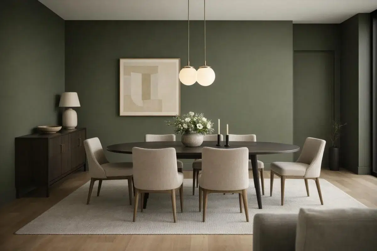
Follow Roycroft Bronze Green from one space to another and watch how light, scale and surrounding materials reshape its character. 14 sourced room photos sit alongside 7 generated visualizations.
3 Living Room Photos
In a space shaped by conversation, quiet evenings and changing daylight, the most interesting quality of Roycroft Bronze Green (2846) may be the way it responds to upholstery, timber, art and metal accents. The green, greige, grey hue classifications suggest the subtle directions the color may take as the room changes.
Walls in Roycroft Bronze Green establish a serene backdrop for living room relaxation.
@mybudgetrecipes

Living room walls in Roycroft Bronze Green enhance natural light beautifully.
@modernprairiestudio

Walls painted Roycroft Bronze Green add warm, sophisticated color to living spaces.
@modernprairiestudio
1 Bedroom Photo
These 1 bedroom image show how Roycroft Bronze Green (2846) can sit beside bed linen, timber, wool and upholstered textures. The green, greige, grey hue classifications suggest the subtle directions the color may take as the room changes.

Bedroom walls painted Roycroft Bronze Green evoke calm and restful atmosphere.
@mybudgetrecipes
8 Kitchen Cabinets Photos
8 kitchen cabinets images place Roycroft Bronze Green (2846) in cabinetry, where color becomes part of the room’s architecture. With an LRV of 8.8, it carries enough visual weight to make light, trim and texture feel especially deliberate.

Kitchen cabinets finished in Roycroft Bronze Green balance modern style with earthy sophistication.
@mybudgetrecipes
1 Bathroom Photo
Roycroft Bronze Green (2846) brings its green character into a compact setting where tile, fixtures and color sit close together. Its muted saturation softens the color’s edges, making texture and shadow part of the composition.

Bathroom walls in Roycroft Bronze Green provide soothing color depth and visual interest.
@mybudgetrecipes
2 Home Office Photos
Across 2 home office images, Roycroft Bronze Green (2846) meets daylight beside desk lamps and screen glow. Its warm classification can feel inviting beside tactile, natural materials.

Home office walls in Roycroft Bronze Green foster focused, grounded productivity.
@mybudgetrecipes

Home office walls in Roycroft Bronze Green provide calm focus for work.
@hollywoodfarmhouse
2 House Photos
Against roofing, masonry, timber, planting and trim, Roycroft Bronze Green (2846) may feel quieter, sharper or more atmospheric than the digital swatch alone. With an LRV of 8.8, it carries enough visual weight to make light, trim and texture feel especially deliberate.

House exterior siding in Roycroft Bronze Green offers natural, sophisticated curb appeal.
@mybudgetrecipes

House exterior in Roycroft Bronze Green offers natural, earthy visual appeal.
@callieblanks.interiors
1 Front Door Photo
The threshold between the street and the interior can draw different notes from Roycroft Bronze Green (2846). The green, greige, grey hue classifications suggest the subtle directions the color may take as the room changes.

Front door painted in Roycroft Bronze Green makes a bold, welcoming statement.
@mybudgetrecipes
3 Misc Photos
Its place within Arts & Crafts (1880s-1910s) and Dreamer hints at the range of palettes it can inhabit. In this setting, let the varied light of hallways, corners and transitional rooms and a changing mix of architectural details and personal finishes guide the final sample decision.

Wall color Roycroft Bronze Green brings rich, muted tone to any space.
@coastalpaintingservicesllc

Roycroft Bronze Green on walls creates understated elegance throughout the home.
@coastalpaintingservicesllc

Accent wall in Roycroft Bronze Green draws depth and character to the room.
@2cees.ranch
Expert Perspectives
Articles and features from across our network of home and design sites.
Coordinating Colors


Summit Gray reflects far more light (LRV 30 vs 9), opening up a space where Roycroft Bronze Green encloses it.


Their light reflectance is nearly identical (LRV 9 vs 7), so neither reads brighter in a room.
Similar Colors


Their light reflectance is nearly identical (LRV 9 vs 9), so neither reads brighter in a room.

Their light reflectance is nearly identical (LRV 9 vs 8), so neither reads brighter in a room.


With LRVs of 10 and 9, the two reflect almost the same amount of light.


With LRVs of 10 and 9, the two reflect almost the same amount of light.

With LRVs of 9 and 9, the two reflect almost the same amount of light.


With LRVs of 9 and 9, the two reflect almost the same amount of light.


Their light reflectance is nearly identical (LRV 9 vs 8), so neither reads brighter in a room.

Their light reflectance is nearly identical (LRV 9 vs 9), so neither reads brighter in a room.


With LRVs of 9 and 8, the two reflect almost the same amount of light.


Their light reflectance is nearly identical (LRV 11 vs 9), so neither reads brighter in a room.
Complementary Colors


Their light reflectance is nearly identical (LRV 9 vs 7), so neither reads brighter in a room.


At LRV 69 vs 9, Starry Night is decisively the brighter choice.


Soulful Blue reads slightly lighter (LRV 20 vs 9), a gap that shows most in low-lit rooms.


Dusty Heather reflects far more light (LRV 28 vs 9), opening up a space where Roycroft Bronze Green encloses it.


A 6-point LRV gap (9 vs 3) makes Roycroft Bronze Green the marginally brighter of the two.

Lavender Wisp reflects far more light (LRV 83 vs 9), opening up a space where Roycroft Bronze Green encloses it.


A 3-point LRV gap (9 vs 6) makes Roycroft Bronze Green the marginally brighter of the two.
Lighter Colors

A 5-point LRV gap (14 vs 9) makes Storm Warning the marginally brighter of the two.


At LRV 22 vs 9, Going Grey is decisively the brighter choice.


A 4-point LRV gap (12 vs 9) makes Braintree the marginally brighter of the two.


Thunderous reads slightly lighter (LRV 15 vs 9), a gap that shows most in low-lit rooms.


A 12-point LRV gap (21 vs 9) makes Link Gray the marginally brighter of the two.
Darker Colors


Roycroft Bronze Green reads slightly lighter (LRV 9 vs 5), a gap that shows most in low-lit rooms.
Their light reflectance is nearly identical (LRV 9 vs 8), so neither reads brighter in a room.
Color Codes
Manufacturer description
This deeply muted green draws inspiration from patinated bronze and forest shadows, creating an atmosphere of quiet contemplation and timeless elegance. Perfect for libraries, bedrooms, or accent walls, its warm earthy undertones pair beautifully with warm wood tones and cream-colored trim.
Attributed to Sherwin-Williams catalog data.