Thunderous
Thunderous is a genuinely dark Green from Sherwin-Williams. Our real-world data shows it is a primary choice when homeowners need to anchor a room without demanding the spotlight. Below, you'll find 26 examples of this shade in actual homes along with suggested color relationships.
Hex
#6D6C62
LRV
14.86
Thunderous's Color Strip
Thunderous is the sixth shade on this 7-color strip, sitting between Link Gray and Cast Iron. The strip spans from Aloof Gray at the lightest end to Cast Iron at the deepest. Browsing strip 216 alongside this color helps you gauge whether to go lighter, darker, or stay right here.


Thunderous in Real Rooms
Thunderous has a low LRV of 14.86 — it absorbs light and reads as a genuinely dark, enveloping color. It's neutral in temperature and , making it adaptable across different lighting conditions and room orientations. Grouped in the Green family, the photos below show it applied in a bathroom, bedroom, front door, home office, house, kitchen, living room, misc, mudroom and kitchen cabinets.
1 Bathroom Photo
In a powder room, Thunderous can be used floor-to-ceiling to create a dramatic, high-impact experience for guests. Because these rooms are small and transitional, they can handle the full intensity of the color's personality without feeling overwhelming.
Bathroom tile work pairs beautifully with Thunderous walls.
@mybudgetrecipes
1 Bedroom Photo
Thunderous has a unique ability to make a bedroom feel larger yet more intimate at the same time. By softening the "edges" of the room, the walls seem to move back, while the warmth of the tone makes the bed feel like a safe, protected island in the center of the space.

Bedroom walls in Thunderous establish a bold, restful atmosphere.
@mybudgetrecipes
1 Front Door Photo
The front door is a great place to experiment with higher sheen levels. Thunderous in a high-gloss finish creates a mirror-like surface that looks incredibly expensive and traditional, echoing the grand entryways of London or New York.

A Thunderous front door makes a striking architectural statement.
@mybudgetrecipes
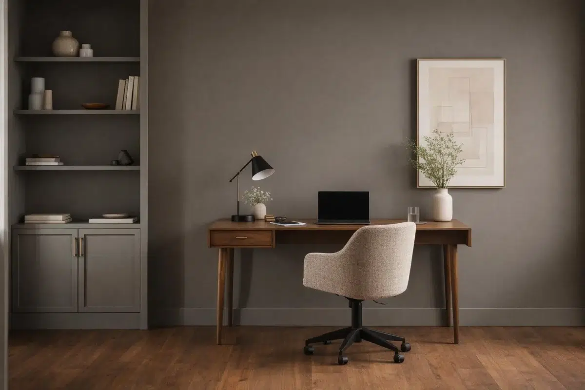
1 Home Office Photo
The transition from "home life" to "work life" can be signaled by the color of the room. Entering a space painted in Thunderous provides a mental shift, telling your brain that it's time to settle in and be productive.

Desk walls painted Thunderous inspire focus in this home office.
@mybudgetrecipes
2 House Photos
For coastal or high-exposure homes, Thunderous is a smart choice. It has the complexity to look good even when dusted with salt or slightly weathered, maintaining its "intentional" look even when the elements are at their peak.

Exterior siding in Thunderous gives this house contemporary curb appeal.
@mybudgetrecipes

Exterior trim in Thunderous complements the home's classic architecture.
@beverlincustomhomes
1 Kitchen Photo
Kitchens are often the noisiest rooms in the house; Thunderous provides the visual equivalent of acoustic dampening. Its steady, calm presence helps lower the "volume" of the room, creating a more pleasant environment for cooking and conversation.

Kitchen walls in Thunderous pair elegantly with light wood cabinetry.
@mybudgetrecipes
3 Living Room Photos
Thunderous anchors the living room with a quiet, architectural confidence. Its depth shifts subtly through the day — cooler in the crisp morning light and significantly warmer by lamplight in the evening — making it a natural fit for a space meant for both high-energy gathering and silent unwinding. To maximize the effect, layer in natural white oak, heavy linen, and soft metallics to let the color truly breathe.

Wall color in Thunderous deepens the cozy living room ambiance.
@mybudgetrecipes

Seating wall in Thunderous frames this comfortable living room.
@athomewithxin

Fireplace accent wall in Thunderous anchors this living room layout.
@athomewithxin
8 Misc Photos
Thunderous shows up in some unexpected spaces in these photos — hallways, laundry rooms, and accent walls. Each one makes the case that the color's versatility extends well beyond the obvious applications into every corner of the home.

Shiplap paneling painted Thunderous adds depth and character.
@taggeboxlane
1 Mudroom Photo
The mudroom is often the first interior space guests see. Thunderous makes that threshold feel considered and designed without demanding more attention than it deserves. It's a "hardworking" color that still maintains its dignity.

Mudroom walls in Thunderous withstand high-traffic family living.
@pinewoodinterior
7 Kitchen Cabinets Photos
When you use Thunderous on cabinetry, you're embracing furniture-grade sophistication. It elevates standard cupboards into something that feels custom-built, especially when paired with a satin or semi-gloss finish that lets the light catch the edges of the doors.

Upper cabinets in Thunderous contrast beautifully with light lower cabinetry.
@designingthedillons
Expert Perspectives
In-depth articles and real-home features from across our network of home and design sites.