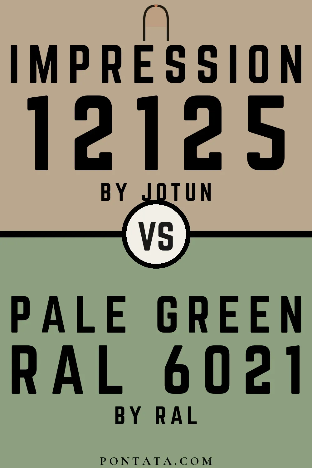
Impression vs Pale Green
Impression is a Jotun color while Pale Green comes from RAL Classic. Impression reads as beige-greige, while Pale Green reads as green — two distinct hue families, not close cousins. At LRV 40 vs 31, Impression will read as the brighter of the two — a 9-point gap that matters most in north-facing or low-light rooms. At ΔE 17.5, these are genuinely distinct colors — a strong contrast if used together, or a meaningful choice between two different directions. Below you'll find 4 real-room photo comparisons where both colors appear side by side, plus 5 simulated room previews.
Impression vs Pale Green in Real Spaces
4 real rooms side by side. Seeing Impression and Pale Green in actual rooms makes the difference concrete; browse the spaces below to get a feel for how each color lives on a wall.
Living Room
Living rooms test a color across a full range of conditions — morning sun, afternoon shade, and evening lamp light all shift how both of these read. Impression returns significantly more light to the room — in a smaller or darker space, that difference in perceived brightness is hard to miss.

Bedroom
Bedroom walls are often seen under warm artificial light, a context that shifts both colors from how they look on a chip. The LRV gap is large enough that Impression will make the room feel meaningfully brighter than Pale Green would.


Kitchen
Kitchen lighting tends to be bright and directional, which sharpens contrast and makes undertone differences more apparent. The LRV gap is large enough that Impression will make the room feel meaningfully brighter than Pale Green would.


Home Office
In a home office, wall color sits in your peripheral vision for hours at a time, so temperature and undertone matter more than you might expect. The LRV gap is large enough that Impression will make the room feel meaningfully brighter than Pale Green would.


Color Details
Impression vs Pale Green Simulated Comparison
5 simulated room previews — drag the slider on each to see Impression on one side and Pale Green on the other.


Digital color is approximate. These simulations are generated from the manufacturer's hex values and overlaid on grayscale room photos — your screen's calibration, brightness, and viewing angle all affect how they render. Before committing to either color, test physical samples in your own space under the light you actually live with.
More Impression comparisons
See how Impression stacks up against other well-photographed colors across different brands and tones.


At LRV 69 vs 40, Ammonite is decisively the brighter choice.


White Dove reflects far more light (LRV 83 vs 40), opening up a space where Impression encloses it.


Impression reflects far more light (LRV 40 vs 6), opening up a space where Iron Ore encloses it.


A 12-point LRV gap (52 vs 40) makes Purbeck Stone the marginally brighter of the two.


A 10-point LRV gap (40 vs 30) makes Impression the marginally brighter of the two.


Mizzle reads slightly lighter (LRV 52 vs 40), a gap that shows most in low-lit rooms.


At LRV 60 vs 40, Agreeable Gray is decisively the brighter choice.


Accessible Beige reflects far more light (LRV 58 vs 40), opening up a space where Impression encloses it.


Impression reflects far more light (LRV 40 vs 27), opening up a space where Denim Drift encloses it.


Their light reflectance is nearly identical (LRV 43 vs 40), so neither reads brighter in a room.


At LRV 40 vs 4, Impression is decisively the brighter choice.


Tranquil Dawn reflects far more light (LRV 55 vs 40), opening up a space where Impression encloses it.


Impression reflects far more light (LRV 40 vs 13), opening up a space where Bancha encloses it.


Hardwick White reads slightly lighter (LRV 44 vs 40), a gap that shows most in low-lit rooms.


At LRV 84 vs 40, Pure White is decisively the brighter choice.


At LRV 40 vs 21, Impression is decisively the brighter choice.


Balboa Mist reflects far more light (LRV 66 vs 40), opening up a space where Impression encloses it.


Shoji White reflects far more light (LRV 74 vs 40), opening up a space where Impression encloses it.


Snowbound reflects far more light (LRV 83 vs 40), opening up a space where Impression encloses it.


A 10-point LRV gap (51 vs 40) makes Pigeon the marginally brighter of the two.


Impression reflects far more light (LRV 40 vs 12), opening up a space where Pewter Green encloses it.


Impression reflects far more light (LRV 40 vs 8), opening up a space where Duck Green encloses it.


Skimming Stone reflects far more light (LRV 68 vs 40), opening up a space where Impression encloses it.


Their light reflectance is nearly identical (LRV 41 vs 40), so neither reads brighter in a room.


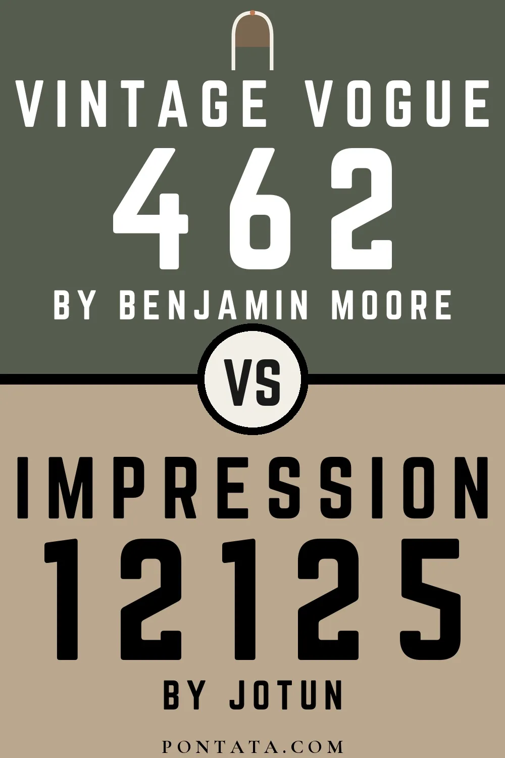
Impression reflects far more light (LRV 40 vs 12), opening up a space where Vintage Vogue encloses it.


Saybrook Sage reads slightly lighter (LRV 45 vs 40), a gap that shows most in low-lit rooms.


At LRV 40 vs 7, Impression is decisively the brighter choice.