
After the Rain
After the Rain begins as a blue color on paper, then shifts with every surface, shadow and neighboring material. Its blue classifications hint at the directions it may take as daylight, lamps and neighboring colors move around it. Treat the digital swatch as an opening note, then watch a physical sample from morning light through evening lamps.
Hex
#8BC4D1LRV
49.42
After the Rain's Color Strip
After the Rain is the third shade on this 7-color strip, sitting between Liquid Blue and Nautilus. The strip spans from Aviary Blue at the lightest end to Amalfi at the deepest. As part of strip 166, these colors are curated to work together — helpful when you're deciding how light or deep to go.


After the Rain in Rooms
Follow After the Rain from one space to another and watch how light, scale and surrounding materials reshape its character. 10 generated visualizations explore how the color might shape a finished room.
1 Front Door Photo
After the Rain (9047) can change noticeably under direct sun, porch shade and evening exterior light. Sample it beside the finishes that will remain in the room.
traditional front door featuring After the Rain by Sherwin-Williams
@mybudgetrecipes
1 Bedroom Photo
After the Rain (9047) brings its blue character into a room designed around rest, softness and retreat. Its brighter saturation allows the hue to remain present rather than fading quietly into the background.

A cozy bedroom painted in After the Rain
@mybudgetrecipes
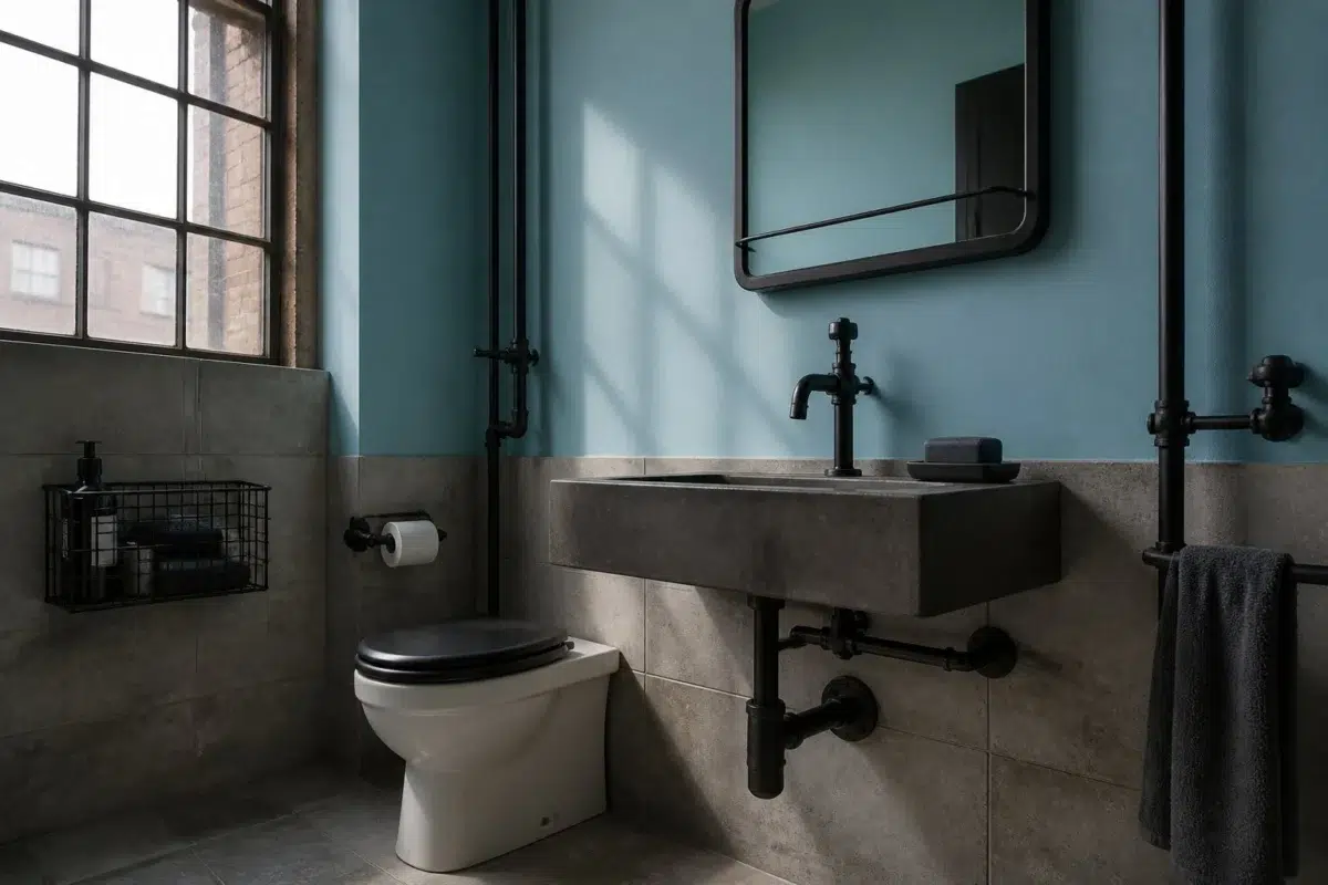
1 Bathroom Photo
Viewed across 1 bathroom image in a compact setting where tile, fixtures and color sit close together, After the Rain (9047) reveals how much color depends on scale, surface and shadow. An LRV of 49.4 lets the color hold its identity across both brighter and more shaded parts of the room.

After the Rain — industrial bathroom
@mybudgetrecipes
1 Dining Room Photo
After the Rain (9047) offers a starting mood rather than a finished formula: Its cool classification can bring a composed, clean tension to warmer finishes. Test it under natural light, candles and pendant lighting.

After the Rain paint in a mid century dining room
@mybudgetrecipes
1 Home Office Photo
1 home office image trace After the Rain (9047) through the transition between focused work and the rest of the home. Its place within Living Well hints at the range of palettes it can inhabit.

Sherwin-Williams After the Rain in a minimalist home office
@mybudgetrecipes
1 Living Room Photo
1 living room image place After the Rain (9047) in a space shaped by conversation, quiet evenings and changing daylight. An LRV of 49.4 lets the color hold its identity across both brighter and more shaded parts of the room.

A industrial living room painted in After the Rain
@mybudgetrecipes
1 House Photo
1 generated visualization explores how the color might shape the finished space. Together they show After the Rain (9047) as inspiration rather than a promise of an identical result.

After the Rain color — aesthetic house inspiration
@mybudgetrecipes
1 Mudroom Photo
Across 1 mudroom image, After the Rain (9047) meets doorway light and the softer illumination of an internal passage. Its cool classification can bring a composed, clean tension to warmer finishes.

After the Rain paint in a coastal mudroom
@mybudgetrecipes
1 Kitchen Photo
Viewed across 1 kitchen image in a hardworking room where color meets movement and strong surfaces, After the Rain (9047) reveals how much color depends on scale, surface and shadow. An LRV of 49.4 lets the color hold its identity across both brighter and more shaded parts of the room.

After the Rain — bold kitchen
@mybudgetrecipes
1 Patio Photo
The 1 patio image turn a blue swatch into something more spatial and expressive. Its brighter saturation allows the hue to remain present rather than fading quietly into the background.

warm patio featuring After the Rain by Sherwin-Williams
@mybudgetrecipes
Expert Perspectives
Articles and features from across our network of home and design sites.
Coordinating Colors


At LRV 78 vs 49, Sky High is decisively the brighter choice.


Creamy reflects far more light (LRV 81 vs 49), opening up a space where After the Rain encloses it.


After the Rain reads slightly lighter (LRV 49 vs 44), a gap that shows most in low-lit rooms.
Trim Color
At LRV 78 vs 49, Sky High is decisively the brighter choice.
Similar Colors


Their light reflectance is nearly identical (LRV 49 vs 47), so neither reads brighter in a room.


A 5-point LRV gap (54 vs 49) makes Gentle Aquamarine the marginally brighter of the two.


A 7-point LRV gap (56 vs 49) makes Cloudless the marginally brighter of the two.


After the Rain reads slightly lighter (LRV 49 vs 46), a gap that shows most in low-lit rooms.


With LRVs of 52 and 49, the two reflect almost the same amount of light.

After the Rain reads slightly lighter (LRV 49 vs 42), a gap that shows most in low-lit rooms.


With LRVs of 51 and 49, the two reflect almost the same amount of light.

Their light reflectance is nearly identical (LRV 49 vs 49), so neither reads brighter in a room.


After the Rain reads slightly lighter (LRV 49 vs 41), a gap that shows most in low-lit rooms.

Liquid Blue reads slightly lighter (LRV 60 vs 49), a gap that shows most in low-lit rooms.
Complementary Colors

At LRV 76 vs 49, Mauve Tinge is decisively the brighter choice.


With LRVs of 50 and 49, the two reflect almost the same amount of light.


At LRV 49 vs 35, After the Rain is decisively the brighter choice.


At LRV 81 vs 49, Heavenly White is decisively the brighter choice.

Original White reflects far more light (LRV 74 vs 49), opening up a space where After the Rain encloses it.

After the Rain reflects far more light (LRV 49 vs 35), opening up a space where Palisade encloses it.


After the Rain reflects far more light (LRV 49 vs 5), opening up a space where Bitter Chocolate encloses it.
Lighter Colors


Bathe Blue reflects far more light (LRV 71 vs 49), opening up a space where After the Rain encloses it.


Cay reads slightly lighter (LRV 58 vs 49), a gap that shows most in low-lit rooms.


A 6-point LRV gap (55 vs 49) makes Vast Sky the marginally brighter of the two.
A 5-point LRV gap (54 vs 49) makes Gentle Aquamarine the marginally brighter of the two.


Aviary Blue reflects far more light (LRV 73 vs 49), opening up a space where After the Rain encloses it.
Darker Colors
After the Rain reads slightly lighter (LRV 49 vs 42), a gap that shows most in low-lit rooms.
Their light reflectance is nearly identical (LRV 49 vs 47), so neither reads brighter in a room.


After the Rain reflects far more light (LRV 49 vs 32), opening up a space where Freshwater encloses it.
Color Codes
Manufacturer description
Step outside after a summer downpour and breathe in the crisp, cool air—this bright, saturated blue captures that moment of renewal with its clean, invigorating presence. Perfect for bathrooms, kitchens, or any space craving a sense of clarity and freshness, it pairs beautifully with soft grays and crisp whites.