
Taupe of the Morning
There is more to Sherwin-Williams Taupe of the Morning (9590) than the swatch alone: its depth, undertones and setting all shape the final impression. Its warm classification can bring a gentle glow to the color, particularly beside natural wood and softer whites. Because screens flatten both light and texture, sample the paint beside the finishes that will ultimately surround it.
Hex
#DAD2C6LRV
64.98
Taupe of the Morning in Rooms
Follow Taupe of the Morning from one space to another and watch how light, scale and surrounding materials reshape its character. 11 sourced room photos sit alongside 7 generated visualizations.
2 Living Room Photos
These 2 living room images show how Taupe of the Morning (9590) can sit beside upholstery, timber, art and metal accents. The beige, greige hue classifications suggest the subtle directions the color may take as the room changes.
Living room walls dressed in Taupe of the Morning feel serene.
@mybudgetrecipes

Living room walls in Taupe of the Morning provide a soft, inviting backdrop.
@la_paint_llc
1 Bedroom Photo
1 generated visualization explores how the color might shape the finished space. Together they show Taupe of the Morning (9590) as inspiration rather than a promise of an identical result.

Bedroom walls painted Taupe of the Morning promote restful sleep.
@mybudgetrecipes
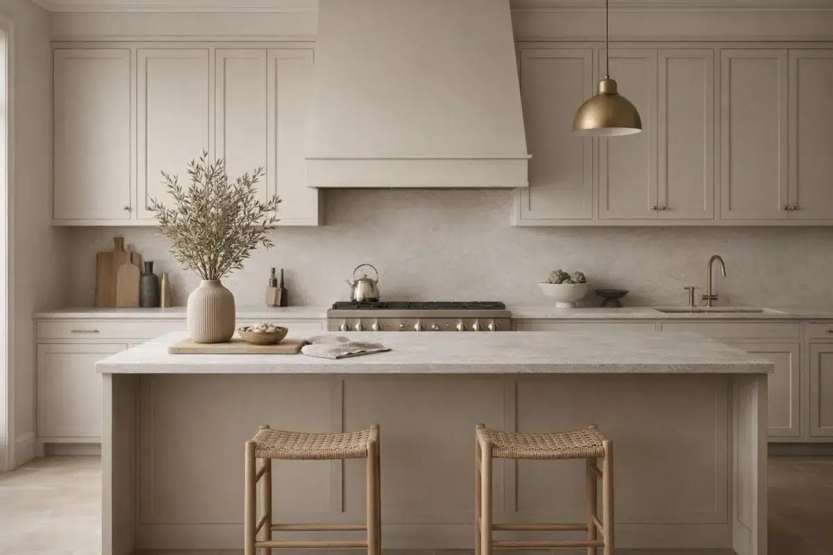
1 Kitchen Photo
1 kitchen image place Taupe of the Morning (9590) in a hardworking room where color meets movement and strong surfaces. An LRV of 65.0 lets the color hold its identity across both brighter and more shaded parts of the room.

Kitchen cabinets refinished in Taupe of the Morning provide timeless appeal.
@mybudgetrecipes
4 Bathroom Photos
These 4 bathroom images show how Taupe of the Morning (9590) can sit beside tile, stone, glass, timber and metal fixtures. The beige, greige hue classifications suggest the subtle directions the color may take as the room changes.

Bathroom tile contrasts softly with Taupe of the Morning walls.
@mybudgetrecipes

Bathroom vanity cabinets gain elegance in Taupe of the Morning.
@apqpaint_jax

Bathroom walls glow warmly in Taupe of the Morning.
@redbird_home_design

Powder room walls perfect with Taupe of the Morning.
@redbird_home_design
1 Home Office Photo
1 home office image trace Taupe of the Morning (9590) through the transition between focused work and the rest of the home. Its place within Emerald Designer Edition - Warm + Welcoming hints at the range of palettes it can inhabit.

Home office walls inspire focus in warm Taupe of the Morning.
@mybudgetrecipes
1 House Photo
1 generated visualization explores how the color might shape the finished space. Together they show Taupe of the Morning (9590) as inspiration rather than a promise of an identical result.

Exterior shutters painted Taupe of the Morning complement neutral siding.
@mybudgetrecipes
1 Front Door Photo
Taupe of the Morning (9590) can change noticeably under direct sun, porch shade and evening exterior light. Sample it beside the finishes that will remain in the room.

Front doors in Taupe of the Morning welcome with quiet sophistication.
@mybudgetrecipes
1 Misc Photo
In an assortment of spaces that reveals the color outside a single design formula, the most interesting quality of Taupe of the Morning (9590) may be the way it responds to a changing mix of architectural details and personal finishes. The beige, greige hue classifications suggest the subtle directions the color may take as the room changes.

Wall color Taupe of the Morning bridges warm and cool tones.
@agianinetti
6 Kitchen Cabinets Photos
Taupe of the Morning (9590) moves through 6 kitchen cabinets images without becoming a fixed prescription for the room. Its warm classification can feel inviting beside tactile, natural materials.

Kitchen cabinetry in Taupe of the Morning creates cohesive design flow.
@mareadyfarms
Expert Perspectives
Articles and features from across our network of home and design sites.
Coordinating Colors


At LRV 83 vs 65, Natural White is decisively the brighter choice.


Taupe of the Morning reflects far more light (LRV 65 vs 34), opening up a space where Bedrock encloses it.


At LRV 65 vs 10, Taupe of the Morning is decisively the brighter choice.
Similar Colors


Their light reflectance is nearly identical (LRV 65 vs 62), so neither reads brighter in a room.


With LRVs of 67 and 65, the two reflect almost the same amount of light.


Their light reflectance is nearly identical (LRV 65 vs 65), so neither reads brighter in a room.


Kestrel White reads slightly lighter (LRV 68 vs 65), a gap that shows most in low-lit rooms.


With LRVs of 65 and 64, the two reflect almost the same amount of light.

With LRVs of 65 and 63, the two reflect almost the same amount of light.


Taupe of the Morning reads slightly lighter (LRV 65 vs 62), a gap that shows most in low-lit rooms.

Taupe of the Morning reads slightly lighter (LRV 65 vs 61), a gap that shows most in low-lit rooms.


A 5-point LRV gap (70 vs 65) makes Egret White the marginally brighter of the two.


With LRVs of 65 and 62, the two reflect almost the same amount of light.
Complementary Colors


Taupe of the Morning reflects far more light (LRV 65 vs 7), opening up a space where Tarragon encloses it.


Taupe of the Morning reflects far more light (LRV 65 vs 11), opening up a space where Rain Cloud encloses it.


Taupe of the Morning reflects far more light (LRV 65 vs 7), opening up a space where Sea Mariner encloses it.


Starry Night reads slightly lighter (LRV 69 vs 65), a gap that shows most in low-lit rooms.


At LRV 65 vs 20, Taupe of the Morning is decisively the brighter choice.


At LRV 65 vs 28, Taupe of the Morning is decisively the brighter choice.


Taupe of the Morning reflects far more light (LRV 65 vs 47), opening up a space where Lakeside encloses it.
Lighter Colors


A 8-point LRV gap (73 vs 65) makes Eider White the marginally brighter of the two.


A 4-point LRV gap (69 vs 65) makes Drift of Mist the marginally brighter of the two.


Simple White reads slightly lighter (LRV 70 vs 65), a gap that shows most in low-lit rooms.


Origami White reads slightly lighter (LRV 76 vs 65), a gap that shows most in low-lit rooms.


A 9-point LRV gap (74 vs 65) makes Incredible White the marginally brighter of the two.
Darker Colors


Taupe of the Morning reflects far more light (LRV 65 vs 41), opening up a space where Universal Khaki encloses it.


A 7-point LRV gap (65 vs 58) makes Taupe of the Morning the marginally brighter of the two.


At LRV 65 vs 48, Taupe of the Morning is decisively the brighter choice.


Taupe of the Morning reflects far more light (LRV 65 vs 51), opening up a space where Shiitake encloses it.


At LRV 65 vs 53, Taupe of the Morning is decisively the brighter choice.
Color Codes
Manufacturer description
Welcome in light and air with this warm, soft neutral. Pair it with Bedrock and Forged Steel for a palette that's awake and alive.